One of the issues with Big Data — and Google Analytics belongs in that category — is the signal-to-noise issue. It can be very hard, when you have a huge amount of data to look at, to see the important things.
One of the ways that Google Analytics helps with this is by giving you the option of plotting rows, or adding additional variables to the line graph at the top of your report. This lets you create a graphic view of specific data you want to consider.
How to plot rows
Start with any report. Not all reports offer this option, but most do. If you don’t see the “Plot Rows” button next to “Summary,” try another report. The button won’t be clickable at this point.
Here we’re looking at traffic sources:

Check the boxes next to the data you want to focus on:

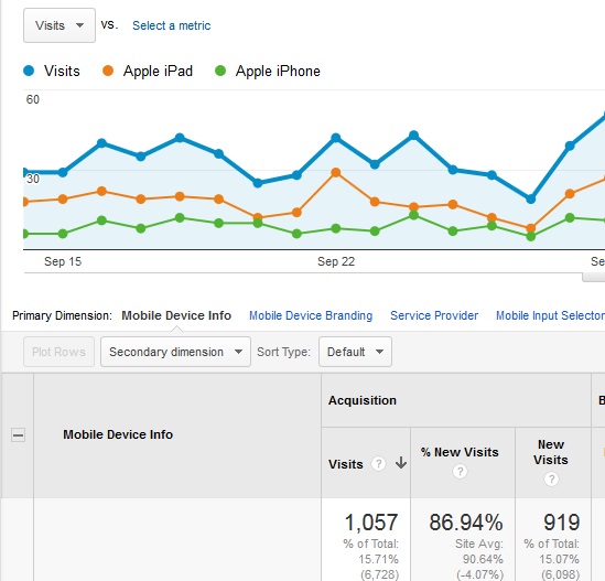
At this point, “Plot Rows” will become clickable:

Click on it, and you’ll see the specific data you’ve asked about in the line graph:

The specific data here is not surprising: we know that Google sends the most search traffic. However, you can use this technique to check on many things. For example, we found that visits from some public school districts are on different schedules from others; it would be hard to see this information without teasing out the strands of data in this way, and the information can affect our blogging schedule.
Try this trick next time you’re deep diving in your data. Just remember it works best with relatively similar numbers — comparing your Amazon Silk and Opera mini traffic with your Internet Explorer traffic, for example, will give you an apparently flat line for the smaller numbers.
Doesn’t sound like fun?
This may not be your cup of tea. It might give you a headache. Or you might see the data, but not be able to come up with actionable information. If so, contact us and we will help.
Leave a Reply