Your company blog probably brings visitors in to many different landing pages through search. Depending on the design of your website, you might have blog posts pulled onto the home page (as we do here at HadenInteractive.com), you might have a single blog page, you might have multiple pages pulling in different topics, or you might have a combination of some or all these options.
You might not think of your blog page as a landing page, especially if you see traffic primarily to your most popular posts or if you pull recent posts to the homepage. However, a peek at your analytics will probably show a number of visitors clicking on that blog page. You want it to look good.
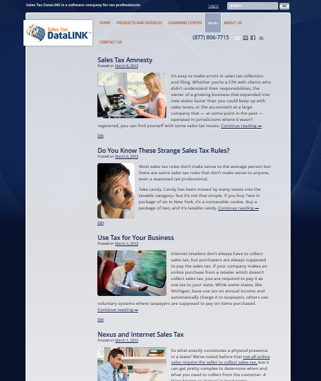
Let me show you a few of the blog main pages from sites we’ve built.
The one at upper left has an excerpt from each blog post, created with the “More” button. The images are different sizes and shapes for a lively, informal look.
The pictures are varied, but they are consistent in style and placement, chosen to appeal to the target market.
The blog on the right is automatically creating identical placement of photos and excerpts of content, using the Featured Image tool. It balances the grid of product logos on the right.
If the blog post excerpts had varied looks, the page could end up cluttered — as you know if you’ve ever visited a blog where the blog posts are casual and there’s also a sidebar or two with randomly placed logos, badges, and buttons.
Which of these two approaches best describes your blog’s main page depends on your theme if you use WordPress. We build custom WordPress sites, so it’s the decision of the designer. If you choose your theme from ready-made ones, check how the blog page is set up when you’re deciding on a theme and make sure it works with the way you want your site to look.
You should also make sure you use the tools you have to get the effect you want. For example, the blog at the top of the page doesn’t use the Featured Image tool, but we could size the images to the precise same size to make it look as though it did if we wanted to.
The third blog uses the “More” button to cut posts at strategic points, and the site owner does not want images. The posts are automatically sorted into categories which provide the primary navigation, and this is one of those internal pages.
The homepage, seen at right, pulls new blog posts into a main column and a featured column, also using categories.

Again, the theme is what determined exactly how the tools will work. If you use a pre-made theme, you may have to experiment to get the effect you want. However, some combination of the More button, categories, and image tools will allow you to make your blog’s main page look as close as possible to the way you want it to look.
The primary takeaways here are probable these:
- Figure out how you want that blog page to look. Don’t ignore it on the assumption that your visitors will.
- Experiment with the available tools and settings — I’ve mentioned the most common ones, but your theme may include more options, including custom post types or multiple page templates.
- If your theme doesn’t give you the look you want, consider customizing it. Hiring someone to make it look the way you want can save you hours of future frustration.
- Avoid random decorative touches like centered titles, multicolored text, or fancy fonts unless they’re part of the theme’s basic design. Not only does this give you a less polished look, it also makes your blog less readable.
Once you have the look of your blog in hand, you may find that you have more readers there than you had before.
Leave a Reply