Your cart is currently empty!
Web design

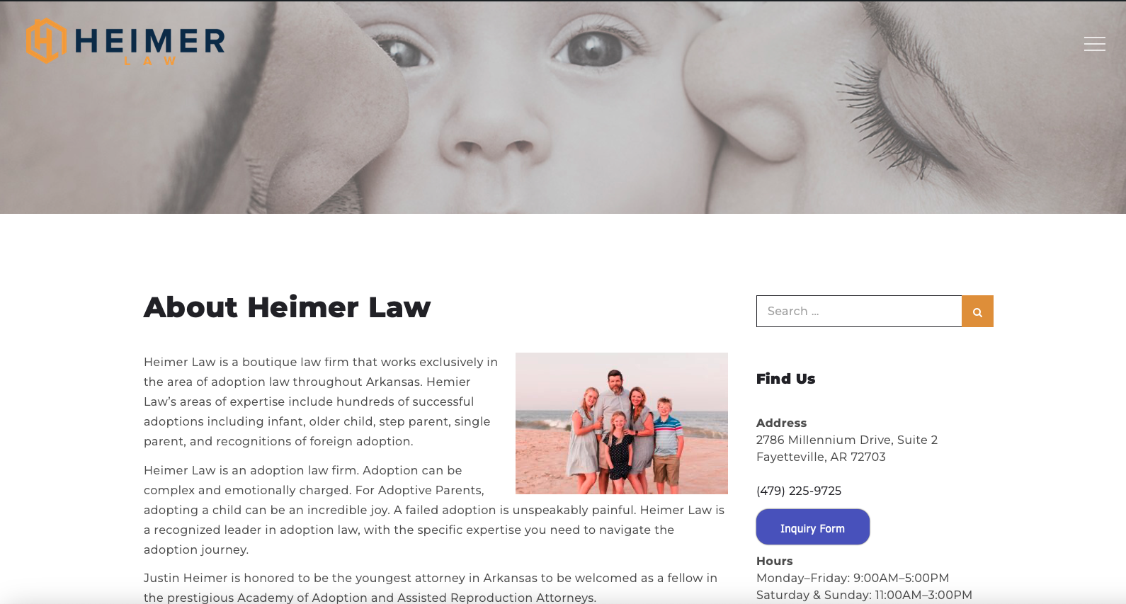
A New Website for a Nonprofit
Our local no-kill animal shelter needed a new website, and we were delighted to build one for them. Nonprofits may not be selling anything (although that’s not always the case), but they certainly want to encourage donations, volunteers, and public awareness of their cause. For all these things, a website is a must. But nonprofits…
Planning a New Website: What’s Your Goal?
We’re always in favor of having goals for your website. SMART goals for this month, this quarter, or this year make sense. After all, you’ll only improve what you measure, and without goals, it’s hard to know what to measure. Click through to the post below for some practical steps to identify goals for your…
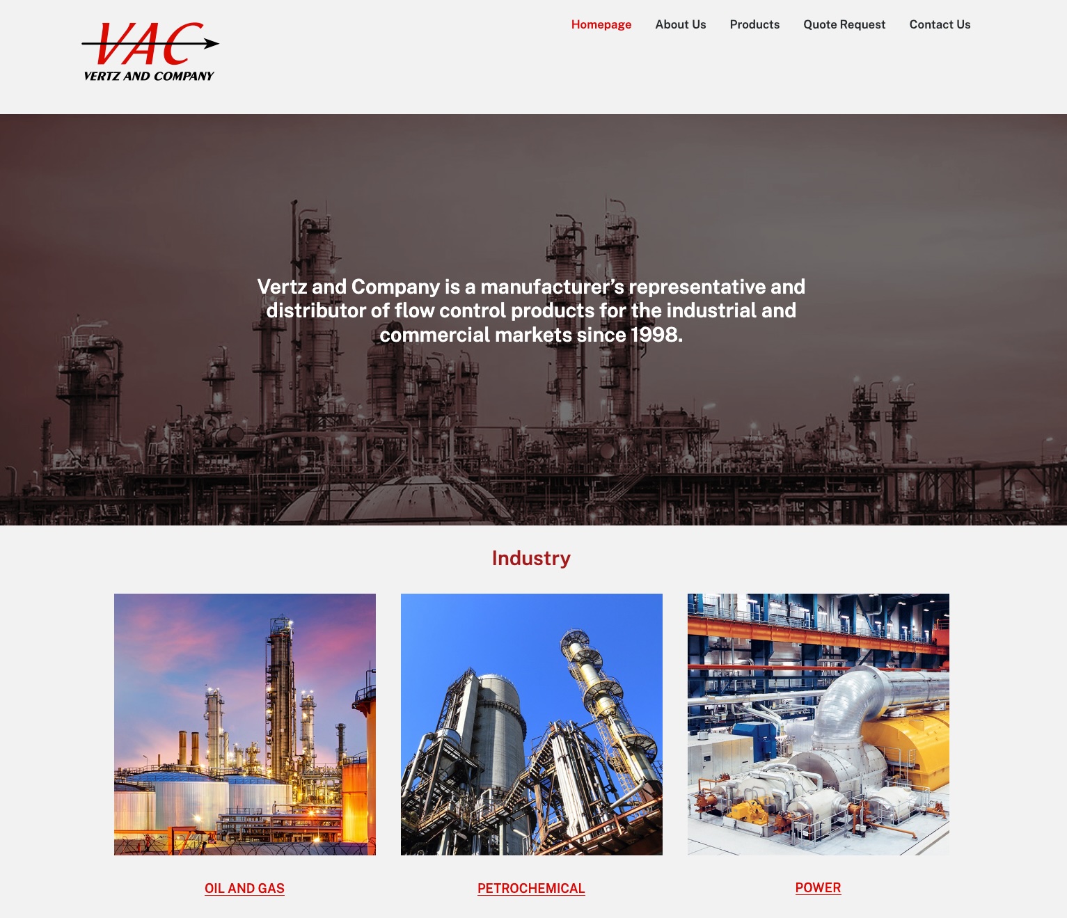
A New Industrial Website
We’ve just launched a new website for a long-term client, a manufacturer’s representative for flow control products. They’re local to us, so we had the opportunity to visit their warehouse and get a clear idea of the products they supply. Every website we build is specifically designed to do the job the site owners need…
Keeping an Eye on Your Website in Progress
Do you like the idea of letting your web team create your website while you go about your business, sometimes wondering with happy anticipation what it will look like? Do you look forward to the day your site is ready as you might look forward to your birthday, when you finally get to open all…
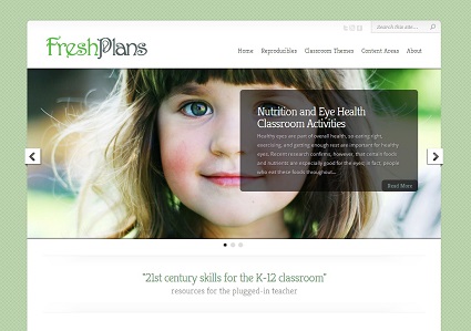
Relaunching a Website
MyFreshPlans.com is Haden Interactive’s lab site. We initially launched it in April, 2011. I had been working with Artsedge, the Kennedy Center’s educational website, and one of my jobs was to find good sites to link to for all the lesson plans I wrote. There I was with PageRank 8 links to hand out, and…
Page by Page: About Us
The About Us page may be the most misused page on the average website. Some designers use it as a catch-all for all the random things the client wants, as though no one would ever look at it. Some site owners use it as a “Why choose us?” page, as though everyone would look at…