Your cart is currently empty!
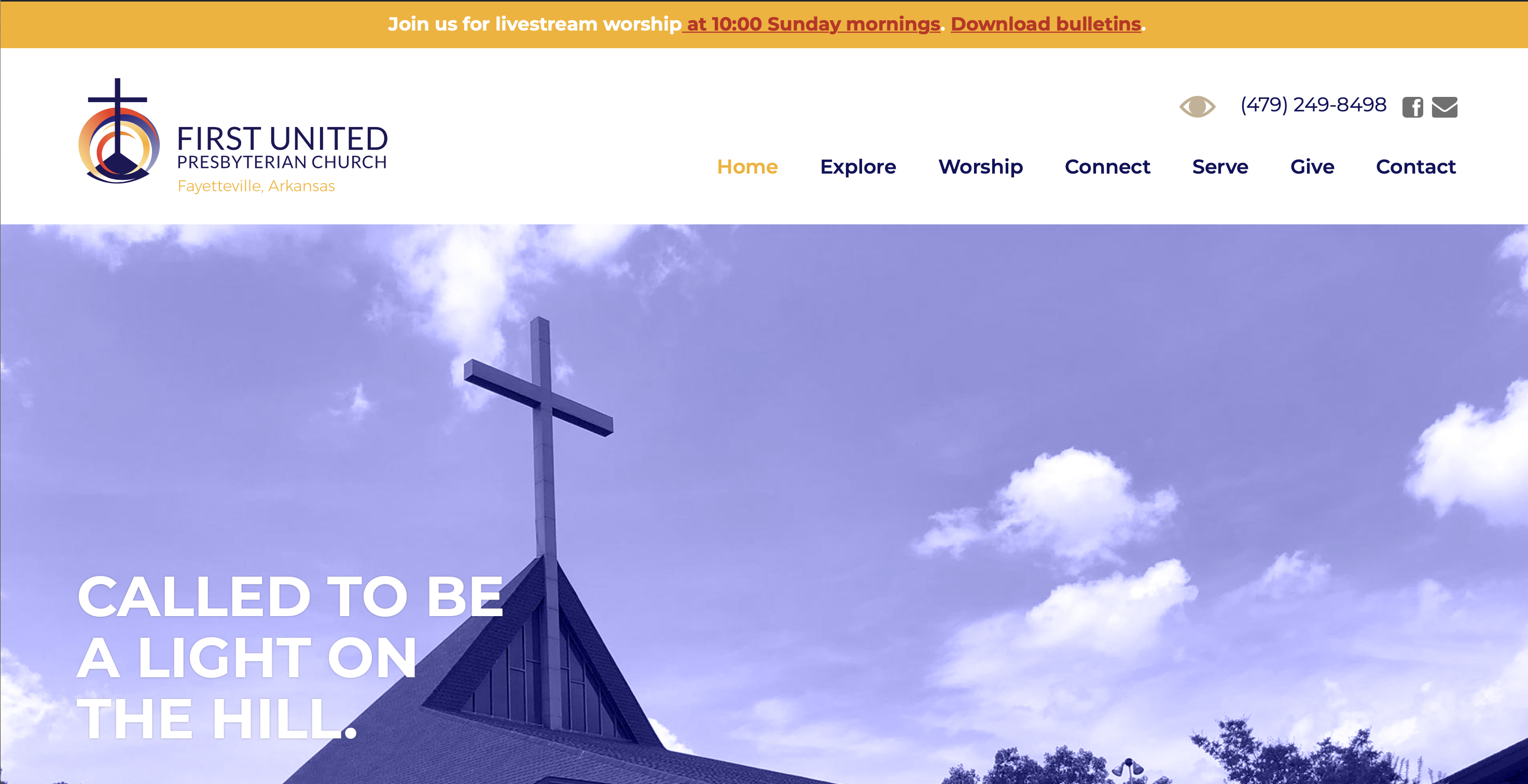
A New Church Website
A decade ago, when I was a freelance web copywriter, I did the content for a local church website. When they decided they needed an update, I was delighted when they came to Haden Interactive for their new design.
With a ten-year-old website, they certainly needed an update. Technology has changed, and it’s time to take advantage of new functionality. Design trends have changed, too, and their old website didn’t capture the style of the church. On the other hand, they took good care of their site and had good hosting, so they weren’t facing the tech problems many site owners have to deal with when they wait that long to update.
They had made a lot of changes to their website on the fly, though, and things had changed in their IRL experience as well. Their building and campus had changed. Their target audience had changed. The tone they wanted to communicate was different. They wanted to include more multimedia, and they had new processes in their office that weren’t supported by their website.
Like a lot of website owners, they had been talking about a new website for a while, and the changes brought by the coronavirus pushed them to take action. In the pandemic, they were relying on live streaming their services, which had not been part of their offerings before. It made sense to take the plunge.
A changing world
The church’s mission statement talks about “our changing world,” and that was a big part of the discussion about the new website. They wanted a website that conveyed a more current message about their organization, and spoke to a younger population. The new design does that job.
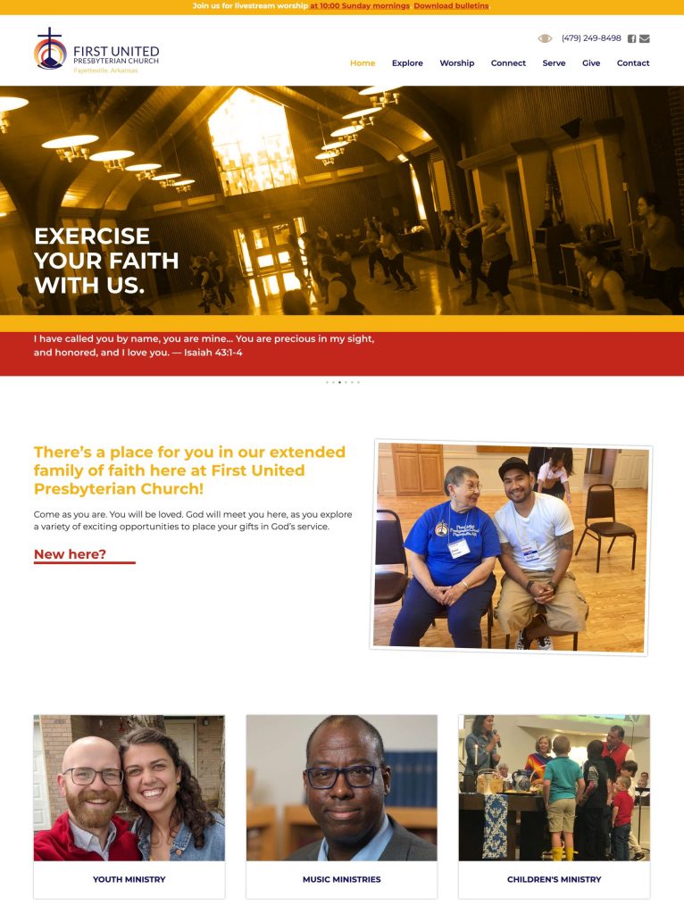
At the same time, we learned that church members had trouble finding their way around the website. They needed a new navigation that made it easy for visitors and members to reach the content. After extensive discussion, we decided on a series of simple, active verbs to provide the main navigation.
Photo grids created a secondary navigation. We used custom fields to make these very easy to change in-house. That meant that the church staff could feature different elements whenever they wanted to, without altering the design or cluttering the page.
Inner pages

Inner pages maintained the same fresh design and gave staff the same high degree of control over their website. With custom fields and featured image functionality in the page editor, team members can add words and pictures with confidence that they will end up in the right places, with the right look.

We took the opportunity to make the inner pages more readable. The site owners were worried that they had too much content, but with reorganization and design changes, we were able to keep the pages from looking wordy — without removing important content.
Sidebars
Sidebars are handled with widgets. Site administrators can choose which pages an item should be shown on, what background color it should have, whether an element should be used on mobile devices, and more. It’s essentially a matter of filling out a form.

The back end of a WordPress website like this gives plenty of options for how changes can be made. It makes sense to work closely with your web team to identify the areas you’ll want to change and the level of control you want to have. Then the website can be built to allow your organization to have the desired level of control in those areas.
Many page builders provide a high level of control in every area — but then they’re hard to use and it’s easy to introduce errors and problems. Instead, you can have a high level of control where you need it, and keep the other areas automatic and easy.
Strategic planning
A church website can have some special needs that differ from those of a business, but all websites can benefit from strategic planning. In this case, a wide range of stakeholders were consulted, but a small number of decision makers kept the process smooth.
We used Google Analytics to discover the demographics of visitors, the most popular pages, and the paths visitors took through the website. Seeing that there were visitors from ages 18 to 65, we made sure that accessibility was a high priority. We also tested with older and younger people to make sure that we reworked any areas that might be confusing or hard to use.
With data-based decisions and plenty of input from stakeholders, we were able to plan a very different site architecture from the old website, with a high level of usability and easy maintenance. Response from the congregation has been positive.
We were also able to make the website take on some tasks people had been managing with outside tools, and to integrate tools from YouTube to their donations system. A website can often help to streamline office procedures, increasing security as well as speeding up processes.
With strategic planning, the right tools, and creative collaboration, we were able to meet the needs of the organization and get their online presence on the right path to meet their goals for the future.
by
Tags:
Leave a Reply