We work mostly with established websites that need to get better results, but there’s something exciting about a brand new website. The first time ever website of Coco McAtee, a sex education speaker and educator, has just launched.
This is a WordPress site designed by Suzanne Hurtig and built by TitusD. Haden Interactive did the text. The homepage features a slider gallery and dynamic recent posts. There are lots of other snazzy things going on, including a PDF brochure to download, videos on many pages, and an events calendar with a couple of different views.
WordPress sites allow this level of complexity without the kind of expense a traditional site would require. However, the factors that make Coco’s site a good one would be true for a traditional site as well.
Let’s look closely:

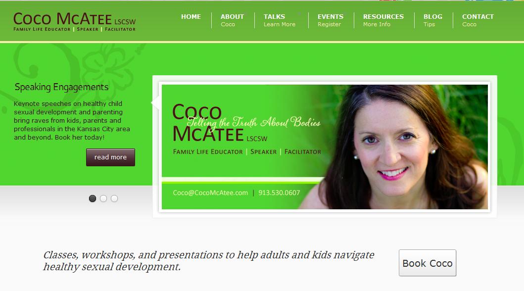
Coco has just seven main items in the navigation of the site. Each one is clear, and there are drop-down menus under each for more detail. This lets visitors find their way to what they really want without confusion or effort.

Coco’s site has her favorite tagline, “Telling the truth about bodies,” as an image in a panel where it won’t confuse the search engines. A clear statement of just what she offers and how to get it is in the upper left “look at me” space where both the humans and the search engines can see it right away.

Since the main thing Coco wants her visitors to do is to call and sign up for classes, the contact information has to be very clear and accessible. This is a good thing for all business websites, actually. Even if you don’t really want people to call you, providing contact info looks more trustworthy.

There’s also a nice, clear “Book Coco” button on every page.
Below the fold where you can’t see it, there’s lots more optimized text with plenty of information for people who like to read a lot, and for the search engines. The amount of text you can see would simply not be enough, but putting plenty below the fold does the job without spoiling the design.
Coco’s new site has the information people need to understand what she does and decide whether to hire her. It has resources that make it a good choice for search engines to offer people looking for information about her subject as well as for people who are ready to make a decision on hiring a speaker or taking a class. It has a bright, positive feel that accurately reflects Coco’s persona and product. It’s a great example of how to get your business online.
Leave a Reply