Your cart is currently empty!
Web design
Creative Navigation
In general, your website’s navigation is not the place to show off your creativity and ability to think outside the box. I always think it’s like an elevator. You step into the elevator and find a cool slideshow on the wall, or a quilted and beaded interior, or a dropped ceiling with interesting lights and…
Testing Sites for Older Users
I wrote about Planning Websites for Older Users a couple of years ago, and the subject has come up again. At that time, we had identified two areas of primary concern: Contrast level of text People over 55 or so have less ability to read text that doesn’t contrast well with the background. This is…

As Simple as Possible
Albert Einstein said, “Everything should be made as simple as possible, but no simpler.”
Get Real with Usability
Some of you know that I teach Freshman Comp in my spare time. I think it’s worth doing; as we work more with people in different places around the world, being able to communicate in writing becomes even more important.
Mimicking Your Competitors
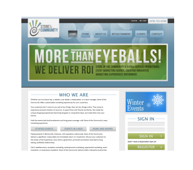
Many industries have a certain look. Store of the Community, whose screen shot you see at right, does some special things, but some of the things they do may be familiar to you: giant inflatables, mascots like Chester the Cheetah, and costumed staff members running events like rodeo trivia quizzes. It’s “retailtainment,” the stuff that…
New Year Website Checkup: Mechanics
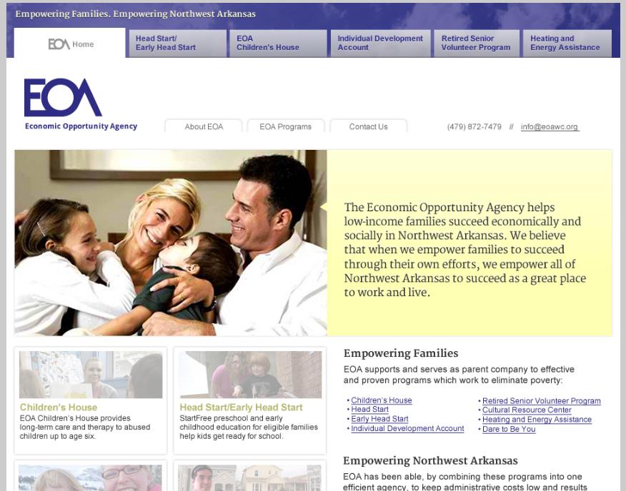
We’re working on a redesign of a local nonprofit agency’s website. The agency needed an update for the sake of more current content and a fresh look, but the main reason they just had to have an update was that their old site was obsolete from the point of view of the technology. This naturally…
