Your cart is currently empty!
Mimicking Your Competitors
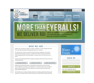
Many industries have a certain look. Store of the Community, whose screen shot you see at right, does some special things, but some of the things they do may be familiar to you: giant inflatables, mascots like Chester the Cheetah, and costumed staff members running events like rodeo trivia quizzes. It’s “retailtainment,” the stuff that makes brick and mortar shopping cooler — at least some of the time — than online shopping.
Store of the Community’s competitors usually have a certain look: bright, bold, often with pictures of cartoon superheroes flexing their muscles.
Completely different from the sophisticated look created for them by Lynergy.
The question is: is this a good thing or a bad thing?
To answer that question for your own site — if you’re sporting a look that’s quite different from the others in your space — ask yourself a few more questions:
- Can your visitors tell what you do? You get about five seconds to make your visitors sure that they’re in the right place. People who feel confused tend to leave the site — after all, there are plenty of fish in the virtual sea. If Store of the Community were, say, a mechanic’s shop, they would probably be too far from their visitors’ expectations. They’d lose people.
- Do you want to distinguish yourself from the competition? I did, when I first started. The average SEO website in those days looked a lot like a car: black, maybe some blue, gleaming curvy edges. Many of my first customers were people who didn’t want to talk to tech guys for fear, as one told me, that they’d be asked how many gigabytes they wanted. “I don’t know what a gigabyte is,” she confessed. I wanted my site to be a friendly place for organizations that needed a website (or a better performing website), whether they knew what a gigabyte was or not. Store of the Community is a little more refined than your average inflatables shop, and they’re showing it.
- Are you on message? We did an elegant website for a llama farm a while back. They’re an elegant llama farm. They run school tours and make luxurious shaving soap gift sets. An elegant site suits them. If you’re selling discount goods and your price is your USP, you don’t really want a look of elegance. You want something that says, “Cheap.” When we build a website, we go through the 4Ds: Data, Discovery, Decision, and only then Design — that is, we get a clear idea of the client’s goals and business approach before we start thinking of a visual identity for them. This lets you be sure that you’re conveying the right message with your website, whether it looks like your competitors’ sites or not.
Your site doesn’t have to be typical. In fact, there are good reasons to go with a different look from whatever is standard in your industry. Just make sure to approach that decision intentionally.
by
Tags:
Leave a Reply