Your cart is currently empty!

Testing Sites for Older Users
I wrote about Planning Websites for Older Users a couple of years ago, and the subject has come up again. At that time, we had identified two areas of primary concern:
- Contrast level of text People over 55 or so have less ability to read text that doesn’t contrast well with the background. This is a physical change that happens in people’s eyes, and while I hear that it can be staved off with exercise and eating plenty of salmon, we have to just accept that older people’s eyes are different from younger people’s eyes.
- Clarity of navigation Older people who are less familiar with the internet are more likely to be confused by navigation. They’re less likely to use hover (mouseover) to gain additional information, less likely to recognize buttons that aren’t super obvious, and more likely to get mixed up. This really seems to be about online experience more than about age, but we see it a lot in older web users, compared with younger ones.
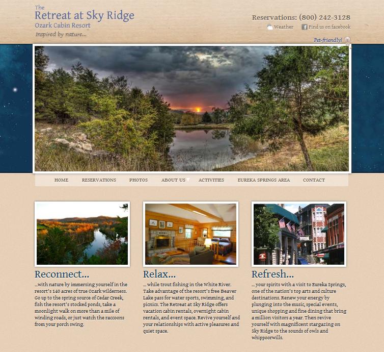
These are the same issues that arose this time around. Tom Hapgood’s beautiful new design for the Retreat at Sky Ridge started out with a soft gold on a deep, Maxfield Parrish blue.
After multiple efforts, it has ended up with almost black on beige.
In the course of the design work, there were repeated requests for elements to be larger or more obvious.
Older friends of the site owner who were asked for feedback toward the end of the design process also reported that “the button was there and then it disappeared,” an indication of confusion over the navigation.
The question is: why did this happen again, when we knew the clientele for this site includes a good proportion of older people and we knew what issues were likely to arise with this population? The answer is: we didn’t test it with older people.
It is very hard to imagine how something looks to someone whose vision is different from your own. Tom and I are not young sprigs, and we both know about the importance of contrast in text. But it wasn’t white on black and we didn’t have any trouble with it, so we failed to realize that the level of contrast wasn’t sufficient for older visitors.
Some things we can judge because of our level of experience. Some we can’t. This is one of the big reasons to test websites. Few web designers are over 55 right now, so most websites are built with no real knowledge of whether they’re accessible to older visitors or not. This problem will disappear an another decade or two when web designers’ eyes begin to get old. In the meantime, make a habit of including older people in your testing.
Tom sent his final version off to his dad, who gave it the thumbs up.
by
Tags:
Comments
3 responses to “Testing Sites for Older Users”
[…] Testing Sites for Older Users, http://www.hadeninteractive.com […]
Hey I’ve been following your blog for some time now.. completely agree with your article !! keep up the good work !!!
Thanks!


Leave a Reply