Your cart is currently empty!

How to Use Your Analytics Report
What should you do with the information from your analytics report?
First, let’s clarify what an analytics report is.
You may be receiving automatic reports pulled from Google analytics and sent to you automatically on a regular basis or pulled by you from the analytics site. There are pre-made dashboards, you can download a specific report you’ve configured, or you might have created a special dashboard of your own. These reports look like this:
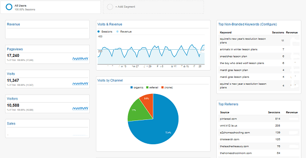
Or, depending on the specific data you’ve chosen to analyze, like this:

They show data in the form of charts, tables, and graphs containing different kinds of information.
You may also use a service or software to pull data from Google Analytics or another source of web analytics information and format it in a different way.

If you get your analytics reports from Haden Interactive or another firm like ours, you may get more text explaining specific information and identifying trends in your data, like this:

However you receive your reports, you may wonder what to do with them. A colleague recently told me, “If they look good, relax. If they don’t, work.” I tend to say, “Do more of what works and less of what doesn’t work.”
Identify what’s working and what needs work.
Let’s look at some examples of a simple report, the Top Channels.

In the pie chart above, we can see that organic search is by far the most important source of traffic for this website. This shows that our SEO efforts are paying off. But it also shows that greater emphasis on social media and seeking referral traffic could increase the overall size of our pie.

This example shows a site that is doing well with social media, but which could get a lot more traffic from organic search. Both examples show websites that could benefit from a good linkbuilding campaign.
In these cases, the analytics report shows areas of strength — telling us that we should continue doing what we’re doing in these areas — and areas of opportunity, where we could put more effort and see stronger results.

Pie charts are simple by their nature, but even a pie chart can be complicated when it comes to making decisions about allocating resources and planning campaigns. In this case, we’re looking at a website with strong email marketing and strong organic search. Social and paid search bring just slivers of this pie’s traffic to the website.
We should continue the successful email marketing and the successful SEO efforts, of course. But should we work on improving social media and paid search?
It depends. If we’ve been slacking off in these areas and making little effort, it could be worth running some clearly configured campaigns to see whether these are areas of opportunity we’re missing out on.
If we’ve been working hard on these channels and they are dwarfed by the effects of our fantastic email marketing, it could make sense to put those channels on auto pilot or quit working on them at all, and put more of our investment into what works for our website.
This is the broadest level of decision making with our analytics report. Beyond what’s working and what needs work, we should also be looking for surprises.
Watch for surprises.
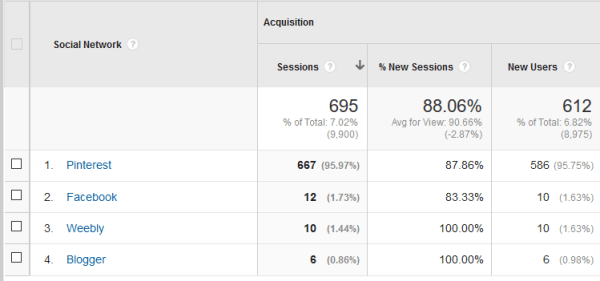
In this case, we’re looking at a website that currently has very little social traffic — only about 7% of their traffic comes from social media. What they have comes almost entirely from Pinterest — not the most common situation. We’re seeing Weebly and Blogger as sources and we’re not seeing Twitter or LinkedIn or G+ at all. This is unusual. We would expect to see Facebook or Twitter in the lead, simply because they have larger audiences.
If we want to try to improve the social media results for this company, we certainly should invest in Pinterest. We might want to try other social platforms as well, but Pinterest is already sending traffic with no effort on our part — presumably just from images readers pin from the company website. This tells us that this property is well suited to Pinterest, so we should dive in and make the most of it.
Find answers.
The next move is to find answers to questions that we already have, or which have come up as we peruse our analytics report. For example, we’re planning an e-commerce section for a client. By delving into her analytics, we can see which categories of products seem to be most popular with current visitors. We can add this information to her in-store data to help plan the site architecture for her new online store.
In another example, we noticed a rise in traffic from Spanish speaking visitors at another client’s website. We can tailor some content for this new group of visitors if we look further into the behavior of this segment so we can understand what they’re looking for.
These are not questions that are likely to be answered in your analytics report. They’re questions that may come up because of information you see in the report, or they may be questions that come up in your business. Once they arise, you can find more useful information in your analytics, or we can help you find the answers you need.
Your analytics report can give you reassurance that things are on track and heading toward your goals. They can show challenges that you might not have been aware of otherwise. They can give you new ideas for campaigns that might provide more good results. They can also provide information that meshes with other data to answer questions that come up in your business.
by
Tags:
Leave a Reply