Your cart is currently empty!

Responsive? Mobile-friendly? Huh?
You’ve probably noticed that there are a lot of smartphones and tablets around lately, you may be aware that people access the internet on many sizes of screens, and you might even have noticed that your company’s website doesn’t look so great on some of those screens. But you might be wondering just what exactly people mean when they talk about responsive or mobile-friendly websites.
Read on.
A responsive website is one that behaves differently according to the size of the screen it’s being viewed on. If you know how to pull the edges of your screen in, you can see this website change as you ensmallen and embiggen the screen. It works best on the homepage, but you can see it on this page, too.
The site has to be built that way in the first place — it’s not automatic. If you are at a website that is not responsive, you will eventually see only part of the screen, rather than seeing the screen change.
A mobile-optimized website, on the other hand, recognizes that it is being seen on a mobile device and serves the user a different website. For example, a doctor’s office might have a mobile website that shows contact information, hours, and a map, while the desktop version of the website includes forms to download or articles about health topics. A restaurant might have a map, phone number, and menu on its mobile site, and save its history and nutrition information for the website.
This type of special mobile website shows up automatically on smartphones, and may also have a button users can click to get to the main website if they prefer.
Both responsive and mobile-optimized sites are mobile-friendly — that is, they both work well on smartphones. Which is better? We currently always build responsive websites, but we can also create special mobile-optimized sites for website that particularly need a different web experience.
However, getting the best possible mobile experience requires thinking about that from the beginning. If you think about your graphics, layout, and content in terms of pages of a particular size, they won’t work as well on a different size screen. If you need to make your website look good for mobile users (hint: you do), then it’s probably time to budget for a redesign.
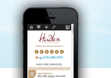
Not sure how your site looks on different devices? MobileTest.me can show you. That’s where the image on this page came from.
by
Tags:

Leave a Reply