Your cart is currently empty!
Testing Calls to Action
Calls to action are the invitations you provide for your website visitors to contact you, make a purchase, or in some other way interact with your company or organization. These are the elements of the website that let your visitors contact you, make an appointment, buy something, or make a smaller commitment that shows intent to purchase.
Some websites have literally no calls to action, but it’s essential that your website visitors know what you have to offer them and how they can get it. Even if your website’s main goal is thought leadership or brand awareness, it’s good to offer an opportunity to subscribe or an invitation to explore the site further.
Here are some basic examples of calls to action:
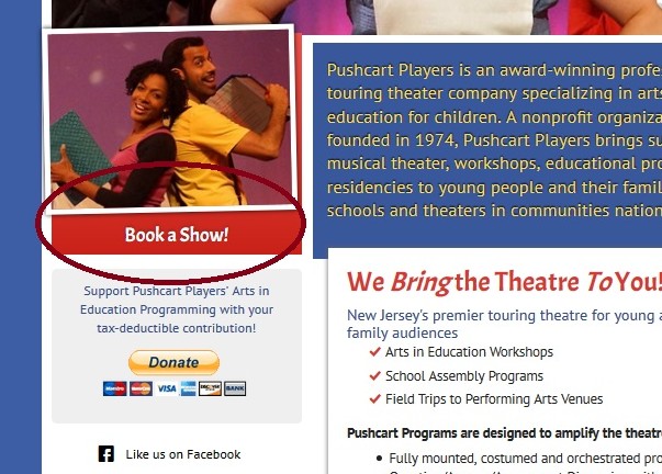
While there are other CTAs in the example above,”Book a Show” is the standout. This is the primary outcome the client wants.

The website above doesn’t offer any simple products you can put into a basket. Getting people to contact them to discuss options is the main goal.

Requesting an appointment is the action most wanted from new visitors to the website above.
In each case, there is a straightforward invitation to take an action, set off visually so that it will catch the visitor’s eye. But there are still plenty of variables, from where your CTA is on the page to the colors you choose and the label on the link to how much the link looks like a button. So how can you know how to make your calls to action most effective?
Test.
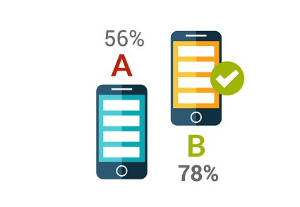
You can set up A/B testing, serving two different pages with different calls to action to website visitors on a random basis and tracking the responses to each option.
But you can also provide a couple of different calls to action and test which one gets more responses.
For one test, we set up an invitation to sign up for a newsletter in the sidebar of the website, and also created a popup ad inviting people to sign up. The offer was the same in each case, and the popup was shown to all visitors. The results were clear:
- 22 individuals signed up in the sidebar box during the test.
- 222 individuals signed up in the popup ad.
The signups from the popup showed a 4% conversion rate, just about the internet standard, and it was ten times more effective than the sidebar box. No question: the popup worked for this website.
Note that we were testing just one variable: popup vs. sidebar. If we had made different offers in the two calls to action, we would not have known whether it was the placement of the ad or the offer that made the difference.
We went on to create an A/B text for the pop-up. We used shorter, more casual text in the B version, and kept the A version the same. We used the Add This service to run the test.
The results were again quite clear:
- The longer text maintained a .4% conversion rate (actually, .41% during the A/B test).
- The shorter text had a .29% conversion rate.
Both were pop-ups and both offered the same thing. Once again, there was just one variable that was different: in this case, the length of the text.
We stopped offering the B version. We did not remove the call to action on the page, but we will continue to use the pop-up.
By testing our assumptions, we got a surprise — we didn’t expect the pop-up to do so much better than the CTA in the sidebar. And we also confirmed an assumption: that a longer invitation with more information would do better than a simpler, shorter invitation. Until you test, you can’t know which of your assumptions will hold up. After testing, you can go ahead with confidence.
by
Tags:
Leave a Reply