Your cart is currently empty!
Website Makeover: Homefront
When Homefront, a company providing oxygen and medical supplies for home health care, decided that they needed a new web design, they had been without a website for a few years. They knew they didn’t want to bring back their old design, but they weren’t sure what they did want. In conversation with owner Mary Ruth Watt, we discovered that a reassuring feel for end user customers needed to be combined with a professional air for insurance companies and others who would refer clients. We brought in designer Tom Hapgood to create a new site with the updated look Homefront wanted.

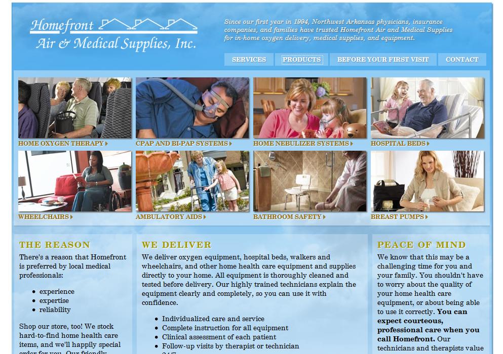
The design shown here is the last one that Homefront had, a few years back. They’re using the same logo, providing much the same information, and they even have similar color schemes at the most basic level: blue and white with touches of pink.
What are the differences?
- More sophisticated color choices. Instead of the stark flat blue and white with different values of pink, the new site has a soft cerulean blue with a suggestion of clouds. The texture and complexity of the background give a sense of movement that encourages visitors to stay and look around. The photo choices reinforce the color scheme and bring in a fawn shade that subtly adds sophistication. The effect is happy and peaceful.
- Lots more information. There’s more visual information on the homepage, with photographs of people happily using the health care products, and there’s also a lot more content — good for search engines and for visitors. Visitors can click on a category of product and the panel of photos is replaced by a more detailed panel for the item they’ve chosen. You can see in the below the panel for nebulizers. It’s easy for visitors to find the information they need, and the effect again is happy and reassuring.

- More interaction. Things have changed since the first site was built. While people seeking home health care products aren’t at the site to play, being able to click on things and have something cool happen gives visitors a sense that Homefront is a modern, up to date company. Tom used technology that works well with search. The interactive map helps people find the company, and also reinforces the feeling that Homefront is on top of things. It’s a bit of extra service for customers.
With our optimized content and a linkbuilding campaign, the new site performs well for Homefront.
by
Tags:
Leave a Reply