Your cart is currently empty!
Writing for the Web
I’m working right now on an enormous content update the Kennedy Center is doing for its educational site. One of the main things we writers on the project are doing is making the content suited to the way people read online.
It’s not the same as the way people read print.
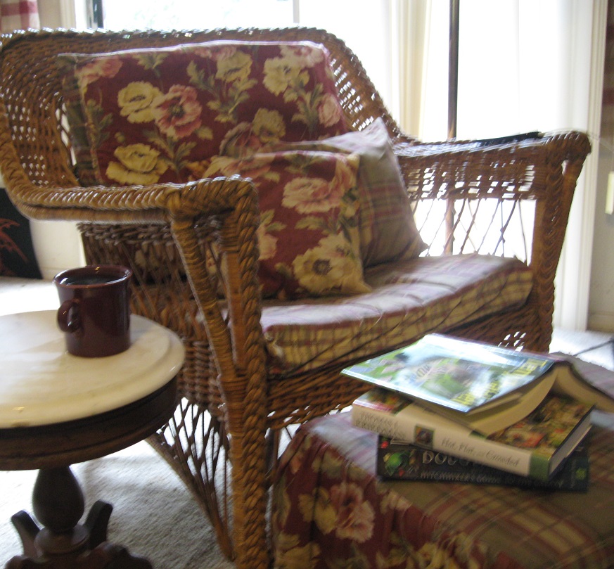
Here, you can see the way people read books — they settle back in comfort, intending to read for an extended period of time. Even if they have several books on hand, they usually plan to read one for quite a while before shifting to another.
People reading online, as you can see below, approach the words differently, at least at first.
It’s usual for people reading at a computer to keep their hands on the mouse or keyboard most of the time. They begin by making a quick decision about whether to stay and read, or to go elsewhere. If they scroll, it may be part of the process of looking over the resource to decide whether it’s useful. The young man in the video scrolled swiftly to the bottom of the page and back up, far too fast to read all the content; the young woman never scrolled at all.
The first seconds of interaction with the screen are just about deciding where to go. Only once that decision is made will visitors actually read your page.
This means that your homepage must, within seconds, let your visitor see that it’s worth reading.
- It can’t look like an ad.
- It can’t require a lot of commitment — like signing in — before showing some good stuff.
- It can’t be a dense block of text that requires reading before deciding to stay. It has to be possible to get an idea of the value by scanning.
How can you make your homepage accessible to web surfers?
- Avoid large blocks of text.
- Use headings that give clues to the content.
- Use bulleted lists
- Make sure that the spacing makes scanning easy.
- Add images to help clarify the point or captivate the visitor.
- Put longer content in a place where people expect to read — your blog, FAQs, pages people click to when they choose to get more information.
- Don’t expect people to scroll before deciding to stay.
- Use a consistent format to help people find what they’re looking for quickly.
Along with the big project, I’m also working with a client who is in the process of rewriting the homepages for a couple of his sites. The same changes that the Kennedy Center needs, this client also needs.
Look at your site. Can your quick visitors enjoy it, or do they need some cushions and a cup of tea first?
by
Tags:
Leave a Reply