Your cart is currently empty!
10 Fussy Things You Should Do for Your Website
One of the reasons that custom websites look so much better than DIY ones is that the designers don’t accept the default settings.
I’ve been doing a lot of work on sites with content management systems lately, from building new WordPress sites to doing SEO facelifts for existing websites. In the course of this, I’ve noticed some small things that can make a big difference to the look of a site. Here’s my Top Ten list:
- Add margins. The text filling your text box all the way up to the edge and cuddling pictures so closely that there’s no white space? Not a good look.
- Change the pictures. A businesswoman I met with this morning said she really liked a stock design she was using, except that she had seen it all over the place. That’s what happens when you use a free template for your blog or website. Often, you can change the header to something of your own without much trouble. If not — well, it’s worth some trouble.
- Resize your pictures. You don’t have to accept the size the picture came in. At the least, make all the images the same size, especially if you’re lining them up.
- Notice the colors. If you don’t know how to adjust the colors of your photos to work well in your page, then perhaps you can adjust the color of your page to work better with the photos. You don’t have to keep your links in bright blue. Clashing colors make people uncomfortable, even if they don’t know what’s wrong.
- Don’t crowd your text. Can you do anything with the line height? If so, think about making it 112% or so, in order to avoid having the downstrokes of a line dangle into the line below it.
- Do you have a good reason for centered text? If, for example, you want that look for a poem you’re writing, I won’t argue with you. For normal paragraphs, it’s distracting.
- Don’t use automatic justification. Lining up the right edge of your paragraph isn’t necessary, and having it done automatically is likely to give you big spaces between your words. Again, distracting.
- Don’t get too fancy with your text. Write interesting stuff. Don’t write boring stuff and then try to jazz it up by making the letters red or playing with all your fonts. Equally, don’t accept varying fonts and font sizes that turn up accidentally.
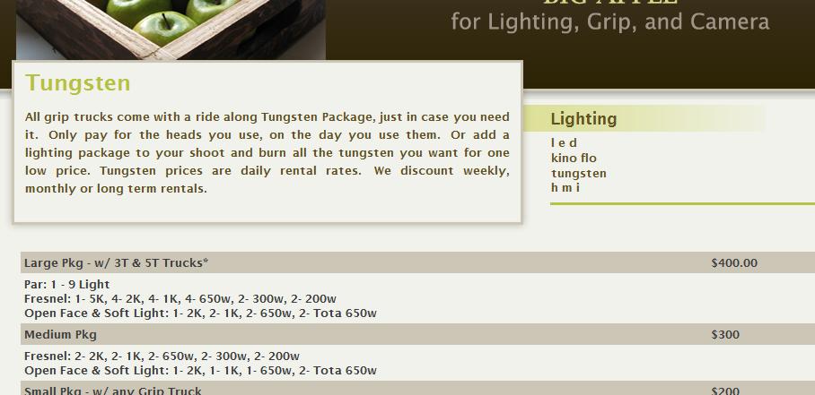
- Style your tables. In the screen shot above, a film production company is listing some information. Doesn’t it look nice? Just because you’re making a table doesn’t mean it has to look utilitarian.
- Proofread. Seriously, if you can’t take the trouble to catch spelling errors, why should I trust you to provide the goods and services you offer, most of which are probably harder to produce than correct spelling and punctuation.
If you can’t do these things, you should seriously consider hiring someone to help you. You probably have better ways to spend your time.
Related posts:
by
Tags:
Leave a Reply