Your cart is currently empty!
Website Coolness vs. Usability
It often happens that once you start thinking of a thing, examples seem to spring up everywhere. I’ve been having that experience with the question of cool websites lately. I’m working on a new website which I particularly want to be cool. Snazzy, even.
Some of the characteristics of coolness in websites that I want to incorporate into the new website are multimedia, photographs of objects, and a sense of play. You know how you get to a website sometimes and feel like it’s a place to stay and play and explore, rather than a place to get information quickly? That’s what I’m going for.
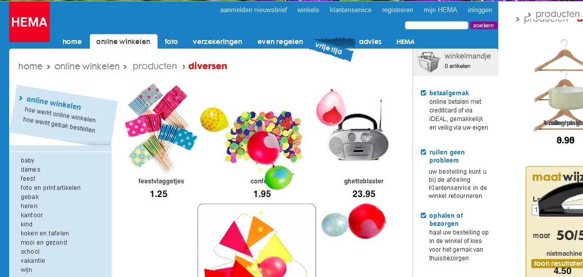
Sitepoint had a great example of that in the HEMA website, a site that starts by looking quite normal but quickly changes as the cup in the picture falls over, knocking the tape down to squish the cake. In the screenshot below, all the products have been jumping around and champagne bottles’ corks have popped, releasing confetti and balloons. The whole thing is quite fun. Go there if you have time, and enjoy the show.

The navigation looks normal, but actually none of it works, and if I wanted to buy a xylophone from these guys, I couldn’t do it.
That website is a toy. I guess HEMA must have a functional website somewhere, but that’s not it.
Then there’s the website pictured below, the homepage of a local photographer. When I first went to it, I was torn, because on the one hand I’ve been feeling quite positive toward the idea of a website where there are photos of objects which do things when clicked — but on the other hand, I have a deadline and I really need a photographer fast.

You will notice that there is nothing on this website which assists a person in getting a photographer fast. There isn’t even anything that lets you know that you have actually found a photographer at all.
Having stopped and stared at the page for a moment, I decided that I’d start with the cell phone, on the theory that a cell phone might symbolize communication and therefore include contact info.
On mouseover, the cell phone showed an email address in a snippet of html code. This obviously isn’t what’s supposed to happen. In fact, I have since clicked on the cell phone, and it gives a phone number and a working email link. I was in a hurry, though, so I didn’t click, but just noted the email address and sent off an email — which bounced.
Now, there are tech troubles here. There’s an email problem, and code showing up where it shouldn’t. You may be thinking that it’s unfair to include that in a discussion of usability, but I’m going to disagree. Computers lend themselves to tech troubles, and we all know that. An email address and phone number clearly shown at the top of the page would have provided the information whether the mouseover was working properly or not, and even if I were among the sizable fraction of the population that doesn’t use mouseover.
It would also have prevented problems created by varying hypotheses. After all, I might also have decided that the keys symbolized the key to entering the site (nothing happens when you click on the keys), or that clicking in the middle of the page would allow me to enter the site (you get an enlarged image of whichever project you’ve clicked on), or that clicking on the address label would get me contact info (nope), or that the money might symbolize hiring and offer a price list or something (it does give you a phone number).
By the time I made a few guesses and clicked on things and waited for the little surprises to load, I might have been sick of the whole thing — I mean, I have a deadline here.
It’s sort of like going to the grocery store to grab some milk and having to make your way through costumed people with food samples and a mime and a juggler and a couple of games. All of that might be fun when you’re in the mood, but it slows down the milk run considerably.
For the grocery store, putting some milk in a case that’s immediately visible from the door is a good plan. For a website, putting contact information in the usual spot is a good plan.
So, as I’m working on this very cool website I’m planning, I intend to think about usability ahead of coolness. Ideally, I’ll end up with a site that gets the same “Oh, how cool! I’ll play with this a bit!” response as these examples, without the irritation of lack of usability.
by
Tags:
Leave a Reply