Your cart is currently empty!
Balanced Web Traffic
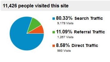
The image at left, from the analytics report of our lab site, probably looks pretty familiar to you if you use Google Analytics at all. This pie chart shows the most general information about your traffic sources: the percentage of your visitors finding you via search, referral, and direct traffic.
All things being equal, we like to see even numbers, or about one third each from these major sources of traffic. A fourth source, campaigns (yellow) should show up if you do email campaigns; this site doesn’t, so the lack of yellow in the pie chart doesn’t mean the campaigns are ineffective.
Our lab site is where we try out things for search, so it has always had a very high proportion of search traffic. There are dangers in this kind of profile, though:
- A change in the search algorithms can lose you a lot of your traffic. In October, this site lost all Google traffic for the term “lesson plans,” which is the subject of the web site. Our traffic fell by half instantly. It’s our lab site, so it was merely another interesting experiment, but for a business, this could be a terrible thing.
- At the very least, a profile like this shows lost opportunities. We’ve had fewer than 1,000 direct visits. If we increased that number by networking, advertising in the physical world, or increasing our online visibility to increase brand awareness, we could increase the number of direct visits. This wouldn’t decrease the number of visitors who arrived via search, so why not do it? Ditto for referrals and campaigns — with no traffic from campaigns and only 11% from referred traffic, this site could definitely grow if linkbuilding and email marketing were added to the mix.

When you see a pie chart like this one, you’re seeing more than half of your traffic coming directly to your website. This can mean a couple of different things. First, it can mean that you are so well known and have such a great URL that lots of people go to your site directly.
If your pie chart looks like this, ask yourself how much you resemble Amazon.com. Have you invested as much as they did in radio ads in order to get your site off the ground? Is your name as much a household word, at least among your potential customers, and is your web address as obvious?
If not, chances are good that a very high proportion of direct visitors is caused by your failure to filter out your workers or yourself. Your staff may pull up the website to show things to customers (they certainly should), you may visit your site as part of your morning ritual, or your web workers may go to post your blog or to get information for linkbuilding or social media. Filter them out of your analytics for accuracy.
If you’ve filtered everyone out and your site is not similar to Amazon.com, then a preponderance of direct traffic can mean that you have a small number of very faithful visitors. Check under Audience>Behavior and see if you have less than 80% new visitors. Linkbuilding and social media can help you extend your reach.

A pie chart like this shows an unusually high proportion of referral traffic. This can happen when you have links from a very influential site or a bit of linkbait goes viral. We’ve also seen this when we’ve set up on offsite blog to send traffic to a site. The problem with this is that it’s usually not sustainable. You’re relying on someone else to send you traffic, and when that source dries up, your traffic dries up with it. If you have a profile like this and you know it’s a temporary thing (big traffic from StumbleUpon, for example), that’s okay. If this represents your usual traffic pattern, though, it suggests that you work on optimizing your site for search.
This pattern can also show heavy reliance on social media. In that case, ask yourself how sustainable that reliance is. Do you have staff members or web pros putting in significant paid time, or are you spending every free minute doing it yourself? If it’s the latter, ask yourself if you can keep that up. Is your other work that expendable, or your life outside of work that uneventful? Will it continue to be so in the future?
Social media is great — just be sure you’ve budgeted for it if you plan to rely on it for your marketing. There’s a widespread belief that social media marketing is free, but that’s only true if you don’t count the time involved.

Here’s a site that has fairly even amounts of direct (orange) traffic and referral (green) traffic, but comparatively little search. This usually means that your site needs to be optimized better for search. It can mean that you’re doing a great job of social media and offline advertising. However, search is the most automatic source of traffic, and therefore is likely to be the cheapest. Improving your search results when you have a profile like this can be an investment with excellent ROI.


This is a fairly balanced profile, and the two examples you see are just a couple of examples of this kind of look from our collection. Most of the sites we work with have search as the #1 source of traffic, and these show balance among the other traffic sources or a bit less for campaigns since they may be the costliest option. Organic search is the “set it and forget it” of traffic sources, and typically the one with the least cost once you have a good site built. As long as you’re seeing steady increases in traffic from other sources as well, it’s probably okay to have a bit more than half.
Check your pie chart and see where you have opportunities for expansion that you’re not exploring yet.
Comments
One response to “Balanced Web Traffic”
[…] Balanced web traffic [Haden Interactive] Share this:EmailFacebook « What we’re not surprised by in new Pew report […]
Leave a Reply