Your cart is currently empty!
A Beautiful New Ecommerce Website
Holland Wildflower Farm is a 30 year old nursery and farm specializing in wildflowers and native grasses. They provide seed for city parks, highway beautification projects, USDA-sponsored wildlife encouragement plantings, school projects, urban forestry undertakings, and much, much more. While most of their sales are large scale and intended for public use, they also sell seed packets for home use to some retailers.
They started out three decades ago selling plants and seeds at the Fayetteville Farmers market, but when they came to us they made most sales by phone or with purchase orders faxed or mailed to them. For a business of their size and complexity, this could easily become overwhelming. Phone orders easily became lengthy phone consultations and written orders often need clarification.
Of course, customers also wanted online ordering. This is the 21st century. Holland Wildflower Farm needed the added automation provided by a great ecommerce website.
They already had two websites, actually. The first was a site from the 20th century. It didn’t look great on all devices, and it didn’t inspire confidence in the major customers who are the farm’s main target market, but it got enough orders that the owners were nervous about removing it.

They had built a second website. It did not get orders. There were some aspects of the site that the owners liked and wanted to keep, but the design didn’t really convey the feeling of the farm, and there were issues with the site structure that probably got in the way of a smooth path to purchase.

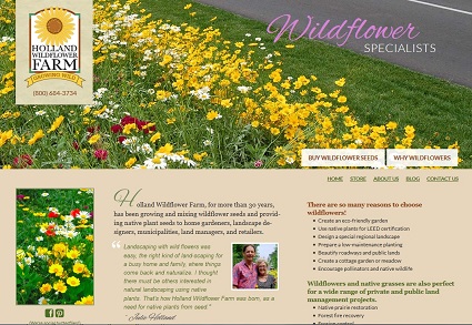
We started from scratch with Tom Hapgood’s beautiful design:

The screenshot above shows the look above the fold, but the site is stacked:

The section above the fold gives a clear statement of who they are and what they have to offer, with clear calls to action: buy wildflower seeds and learn more about wildflowers. Since the majority of shoppers are either buying native plant seeds because they have a directive to do so from an agency or a landscape designer, and a second group has some incentive to do so but wants to learn more, those are the best calls to action. We expect that many visitors will click on those buttons without scrolling further.
The blue section breaks it down further. There are spotlight boxes linking to pages with rich, informative content for land managers, for organizations such as churches and museums, and for people planning special use gardens such as rain gardens or pollinator gardens.
The two rows of photo boxes are designed for featured products. Tom initially populated those boxes with some of the lovely flower photos from the farm. However, the owners felt that their customers were less focused on the flowers themselves and more concerned about the purpose of the flowers. They suggested using images with more context that would suggest uses like roadside and trailside plantings or golf courses. Each of these links to a page suggesting specific plants best suited to the larger goal.
The next layer calls out the most recent blog posts. There is also some basic information and contact info for wholesale customers wanting retail packaging. Many people will not scroll to the bottom of the page, but for those who do there’s a reward: pretty, Pin-worthy photos linking to articles about some of the most newsworthy issues around native plants.
There is a simple store with a grid of plants:

Shoppers can add items to their carts with one click from these pages, or they can click through for more information:

Each page features beautiful photos and lots of information. We helped the owners get started with adding products, but we also made sure that it would be easy for them to add and update products as they went along, so they could manage it in-house and not have to rely on us to make changes. The photos and their product expertise are both important assets, and we wanted to make sure that their website makes the most of both.
Thoughtful planning of categories means that a shopper who finds a specific product that meets his needs can easily find more such products on category pages:

Much thought was put into the internal pages that give information and suggestions for specific kinds of plantings. Instead of artificially imposing a consistent layout, we worked with the owners to include plenty of photos, videos, and informative text along with the products. People who are interested in creating a meadow can be expected to scroll all the way down the page, so we made these pages long, while also usually placing at least some products above the fold to maximize conversion.

Knowing that various kinds of customers will approach the site differently, we want to make sure that those who arrive by searching “native plants for golf courses” will find themselves on a page with the information and functionality that will let them go ahead and buy their seeds from that page, while also making sure that those who start on the homepage will easily be able to find the right mix for their golf course.
By considering the company’s business model, their customers, their resources, and their brand message, we’ve created a website which they can feel proud of, and which will also work for them to support their company’s goals.
by
Tags:
Leave a Reply