Your cart is currently empty!
Color at Your Website
We’re working right now on a new website for a theater company. They need a completely new website to replace their very old one, but they know that they want to keep one thing the same: plenty of bright, intense color.
The object is to create a playful, exciting feeling.
The other site we’re building this month is for a medical supply company. The site owner wants this site to have a calming blue color palette, perhaps with patriotic touches of red and white.
Indeed, most decisions about website colors have at least some element of thinking about the psychological or emotional effects of color.
We have a fair amount of agreement in our culture about the psychological effects of color. We think, based on poorly supported research from the 1940s, that warm (long wavelength) colors like red and yellow are exciting and irritating, while short wavelength cool colors like blue and green are calming. We often believe that specific colors have specific effects: that yellow makes people irritable, for example, or that green is energizing.
Is it true? Maybe not. Attempts to substantiate these claims with controlled research have generally been unsuccessful. Here are some things that do appear to be true about colors at your website:
- Reactions to color are not hardwired as much as they are a matter of associations. That means they can change. For example, the color orange has traditionally been considered an exciting, aggressive color that makes people hungry, and has also been associated with low prices and low quality. The emphasis on orange in 2012’s Color of the Year, Tangerine Tango, means that orange is no longer strongly associated with cheap goods. At the same time, some industries are associated with particular kinds of colors; a mechanic’s website probably shouldn’t be pink and white.
- Choosing a color or combination of colors and sticking with it is good for branding. Brand recognition and the trust associated with it are very strongly influenced by color. This means that — if your brand is currently associated with a particular color — it’s smart to keep that color when you redesign your website. The colors used in your logo, for example, should be part of the new design. That doesn’t mean that you have to stick with a mauve background just because you’ve got one now; use color along with other elements of your visual brand to encourage brand recognition, not to get stuck in the past.
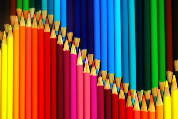
- Color associations are affected by color combinations as well as the intensity of the color. People respond better to harmonious combinations of colors than to jarring ones, no matter what the specific colors are. And the intensity of colors has as much effect, according to research on the subject, as the specific hue (green, blue, red). Much of this still has to do with associations; for example, red and green say “Christmas” to a lot of people, but probably not in this picture:

What does this mean for your website? Think about your current branding, avoid relying entirely on pop psychology for your color decisions, and make sure you choose a designer who’s talented with color.
Other posts about color:
by
Tags:
Leave a Reply