Your cart is currently empty!
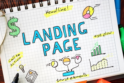
Effective Landing Pages
A Silverpop study of landing pages from email marketing efforts found that most ignored best practices:
- 17% dumped visitors on the brand’s home page, even though the call-to-action usually can’t be fulfilled on the home page.
- 30% sent readers of the email to a landing page that didn’t match the email’s look and feel, even though people tend to feel less trusting and comfortable when this happens.
- Of the emails that contained forms, 45% had more than 10 fields to fill out. Unless you want to pre-qualify your respondents and weed out most of them, the fewer fields the better.
- Almost 70% of the landing pages had navigation bars, which can distract visitors from the main call to action of a landing page.
- Landing pages (sales pages) aren’t intended to be found by search, yet 25% of the landing pages viewed in the study had more than two screen’s worth of content to scroll through.
It might be the triumph of tradition over data or it might just be a lack of awareness of the data, but companies that send their viewers to ineffective landing pages are wasting the investment they made in email marketing.
They may also be wasting their chance to build a relationship with their consumers. Suppose your target market includes Patricia, a health-conscious woman with a family. She sees your email headline, “New Hope for Migraine Sufferers” and is intrigued, since she has occasional migraines. She opens your email, sees that you’re offering a new product she hasn’t tried before, and clicks through to learn more. Instead of finding the product, which she might want to buy, Patricia finds herself on your homepage, which does not show the new product. Or she finds herself on a page listing a variety of nutritional supplements. Or she reaches a blog post on biofeedback, with a full navigation bar at the top and a link to the new product at the bottom of the post.
Any of those things might be interesting, but none of them is what you promised her. None of them will give her quick information and access to the product, which is what she’s expecting.
It’s as though she got into an elevator, pushed the button for the 12th floor, and ended up on the 18th floor instead. She might find something interesting on that floor, but she’s not likely to wander around just in case there’s good stuff available. Her expectations have not been met, and she’s probably disappointed and irritated.
Irritation is not what you want your visitors to feel.
Here are top steps for creating effective landing pages for email marketing campaigns:
- Create a clear call to action and a clear path to conversion. If you want someone to buy your migraine-reduction pillow, make sure that the email subject, the headline of the emailing piece once it’s opened, the headline of the landing page, and the call to action on that page all lead your consumer toward that marvelous pillow. Avoid friction along the way.
- Create design and content that support your message, and make sure they give a consistent experience all along the path to conversion. Your design and content also need to express your brand and to be persuasive as sales content. It makes sense to have a professional involved in this part of the process.
- Identify your goals and metrics and make sure you have a means of tracking your conversion rates and your sales funnel. This information gives you actionable data for future campaigns and helps you make sure that you’re making the best use of your resources.

by
Tags:
Leave a Reply