We’ve just launched a new website for a local engineering company. You can see the new look here, and the old site below.
The old site was, as you can probably tell, quite old. It had a no-nonsense design based on text interspersed with glamorless photos of servomotors. I had persuaded the site owner to let me stick a photo of humans at the bottom of the homepage, but that was as far as the visual appeal went.
The site owner didn’t feel a need for visual appeal. People visit his site, he explained, because their industrial machinery is broken. They’re losing thousands of dollars a minute and they don’t care what the site looks like. All they need is a phone number and a clear list of the products serviced.
We get that. However, we’ve also seen the research showing that consumers trust a modern, professionally designed website more than a website with an outdated design. We also saw traffic at the WordPress.com blog we created for the engineering company steadily gaining organic search traffic, while the main site still relied on paid traffic.

Let’s have a look at the similarities and differences between the two websites:
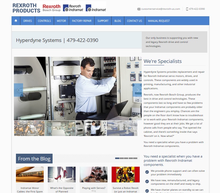
- We kept the client’s color scheme, basic navigation, and overall feeling. The design is clean and modern, but not a shock to the site owner’s system.
- Knowing that the product list and phone number were the most important items, we kept them right in the “Look at me!” spot at the top left of the homepage.
- We also put contact info at the top right, where people are now accustomed to looking for it.
- We added a slider gallery with photos that help communicate the services offered and the industries the company works with.
- We had previously optimized the site’s content, so we just did some updates and moved the text into the new design.
- Since this company does have competitors, we added a scannable list of “Why choose us” points and followed them up with — once again — that all-important phone number.
- The inner pages contain the same photos of machines, but they’ve been tidied up, arranged attractively, and supported by good choices in typography. See a screenshot from an inner page below.
- We built the new site in WordPress for easy updates and imported the blog from its WordPress.com home to the company website so the main site can reap the benefits of having a blog.
- We pulled blog posts onto the homepage, in case visitors who aren’t having an emergency happen by and care to read some interesting information on motion control.

This project shows that your no-nonsense business can upgrade to a more modern website without losing that no-nonsense feeling.
It’s also a good example of a migration from WordPress.com to WordPress.org. We used WordPress Importer, a simple plugin, to speed up the process. Designer Paul Fraley got the theme designed and implemented, and then just imported the files from the existing WordPress.com blog. With the blog imported, we had to do a little cleanup to suit the new theme, but it was generally simple.
The overall result is a much snazzier website. We expect that the new site will appeal to humans and search engines alike.
Leave a Reply