Your cart is currently empty!
First Thoughts on Typography for Your Website
The subject of typography at your website is a large one, and I’m not trying to cover it. I’m assuming here that you’re not doing the design work yourself, and that what you need is enough information to recognize whether you have a problem, to choose a designer who has the skills you need, or to keep the updates you do yourself from making your site look bad.
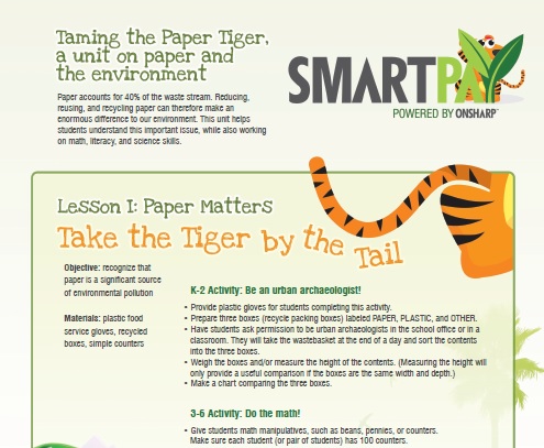
Let’s start with a good example and a bad one. The example above, from the work of Jay Jaro, shows basic things to look for in good typography:
- The left margin is even, and it’s large enough.
- The decoration at the margin is balanced; the proportions are pleasing.
- The right margin, while ragged, is not excessively or distractingly ragged.
- The spacing in between letters and words is smooth
- The spacing between lines is enough for easy reading.
- The spacing between graphic headings and text headings and the main text is well proportioned.
- The decorative headings are still search-friendly text.
- When there is an uneven line, it’s intentional and part of the design (in this case, the titles use a fun font that looks hand-drawn, and the title curves like a tiger’s tail when it says “Take the Tiger by the tail”).
- The differences in colors and fonts are enough to be interesting but not enough to interfere with reading.
- The design is appealing and in keeping with the goal of the page.

The second example, from someone who will remain nameless, has not succeeded in meeting that standard.
If you see this sort of problem at your website, don’t despair. It just means that you need a designer. Find someone whose work is more like the first example than like the second one, and ask him or her to take the text and redesign it.
But what if you use a content management system, and you add content yourself?
Centering text usually looks unprofessional. Justified margins are not much better. You can only pick justified margins if you’re willing to fool around with your wording and font sizing and so on to make it look good. In general, you’re better off just choosing left-justified, where the words line up on the left.
If you take care of your own website, look at it with a critical eye — if it doesn’t look good when you put it on the page, go back and change your words to make it look nice.
Finally, resist the temptation to have lots of variety. The second example has trouble with spacing and margins as well, but much of the daunting effect of the page is the result of the variety of colors, fonts, and decoration. There’s nothing wrong with a little bit of variety, but the rule of thumb should be only to use something different if you have a reason to do so.
In the example at the top of this post, the main text is in a simple, easy-to-read font, black on a light background color. The designer then used another color in the text headings: bold, in a darker shade of the background color. The decorative titles at the top of the page are completely different; they, and the whole color scheme of the page, are based on the major illustration. In the bad example just above, we have different colors all over the page with no apparent plan or intention. There is no illustration, and no color scheme.
by
Tags:
Comments
One response to “First Thoughts on Typography for Your Website”
[…] a big difference in your web page. Read a little more about it (still easy and non-technical) in First Thoughts About Typography for Your Website. /* Share and […]
Leave a Reply