Your cart is currently empty!
Google Analytics Has A New Tool
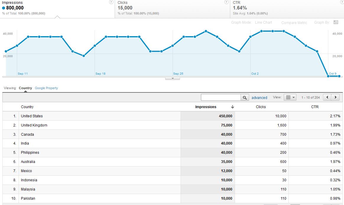
The new Google Analytics SEO reports include Queries, Landing Pages, and Geographical Summary. The geographical summary report gives you two screens to look at. First, the Country report shows you where your page was shown to people, with their click through rates. The screenshot here, for our lab site, tells us that we’re shown to folks in 204 countries, but that English speakers are most likely to click through. This makes a lot of sense for a text-dense site written in English.
For many of us, this information won’t matter. However, we have clients in construction and decorating trades who won’t be traveling out of their home country to visit clients. For them, seeing that people half a world away are clicking through more often than the people in their service area would be bad news. In fact, we like to see 0% click through rates from foreign visitors in these cases, since it shows that people can easily tell that they’re visiting a Kansas City roofer or a Sydney painter.
One of our American software companies, though, has a high click through rate from China. By visiting the Content report and using Country as a secondary dimension, we can see that Chinese visitors are reading the blog at his site. We hope they’re enjoying the information, and we’re not recommending that his staff brush up on their Mandarin yet.
An e-commerce site that saw a high CTR from a neighboring country might look into international shipping options. A site for a sports or entertainment venue seeing a high CTR from another state might consider whether it should offer more content suited to tourists. However, a site that sees a surprisingly large number of impressions outside its service area should also consider whether it’s not communicating that information well to the search engines. So this report can point out new opportunities, but it can also help you find problems in your site optimization.
The other parameter is Google Property: was it an image, a video, the web, or a mobile property that was offered to the searcher? The screenshot below shows you that our lab site had the largest number of impressions from images — but the largest number of clicks from web searches.

This is what we’ve seen on nearly all the sites we’ve examined. The exception is a site that may not have sufficiently cool graphics.
Otherwise, this screen is probably most useful for identifying your site’s overall click through rate. We’ve seen CTRs from 4 to 14% so far, with 10% being about average — but we haven’t seen very much data yet. The information has apparently only been collected since July of this year. We’re thinking that a site with a smaller CTR may not look as good on the SERPs as they should, or they may be confusing the search engines so they’re being offered to the wrong people.
This screen also shows you how many times your site has been offered to people. We feel that a higher CTR is better than a higher number of impressions; given a good click through rate, though, more impressions will be a good thing.
We’re expecting to learn more as we continue working with the new reports; we did a site analysis yesterday without access to them, and kept wishing we had them, so they already have value for us. I think that they are going to be most useful in combination with other reports — no one of these reports will give you enough information to create a strategy.
Leave a Reply