Your cart is currently empty!
How Original Should Your Website Be?
Naturally, you want your website to be different and exciting. You don’t want it to look as though it were made with a template. You want it to be special and unique.
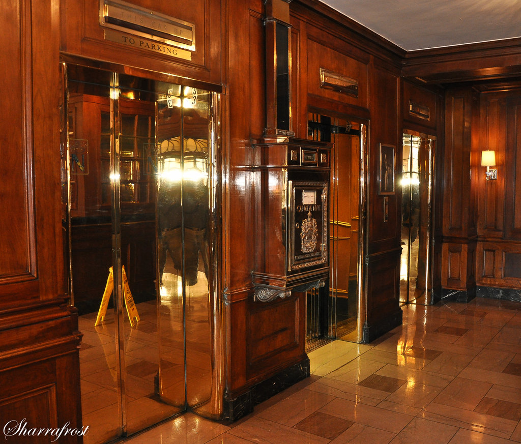
But before you get too carried away, or allow your designer to, think of elevators.
We can be pretty flexible about elevators. The color, the surface decoration, whether there’s a single elevator or a pair or a bank of them.
We’ll accept elevators on opposite sides of a foyer, or both on one side. We can handle different materials.
But there are limits. We want doors, walls, floors. We want the elevator buttons to be very obvious and easily reachable. We have a mental idea of where the front of the elevator is supposed to be, and we expect certain things to be there.
It’s the same with websites.
They can have all kinds of graphics and colors and stuff going on, but they should still meet the user’s expectations. Navigation should be clear and obvious. The most important things should be above the fold, especially on the homepage. Contact information should be in the places where people look for contact information. The name and logo of the company should be readily visible.
Sometimes designers feel that this is limiting. Sometimes I feel like I’m working with designers who think it would be really cool and edgy to put the wheels of the car on the top, in a pentagon. “No, no,” I say, “you have to have the wheels under the car, roughly in the four corners.” I can tell I’m spoiling their fun.
But once the initial coolness of a truly original website wears off, people will find it irritating. They won’t want to go there for practical purposes (like buying things from you or hiring you). So the best plan is to build a usable, search optimized website, and challenge your designer to work within those limitations to create a thing of beauty.
There’s a lot of satisfaction in that.
by
Tags:
Leave a Reply