Your cart is currently empty!
Increasing Response with Good Form Planning
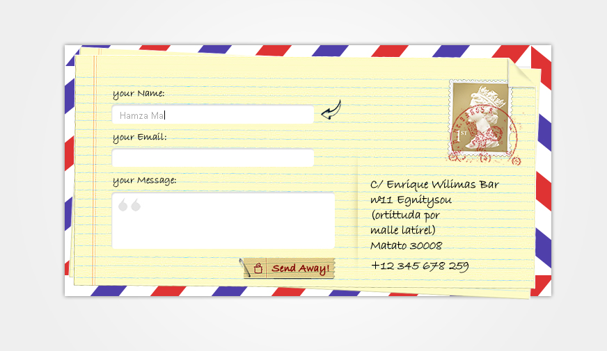
The image below is the current response form at a website I’m working on. I sent suggestions for it along with my site content rewrite.
The client called to discuss it. He liked his form.
“You’re asking for a lot of information from them,” I pointed out, “without giving any of your own. Especially since you go to people’s homes for your service, they’ll feel better about telling you so much about themselves if they see your name and address. What if you met someone and they asked for your name and number but wouldn’t share theirs?”

“When you put it like that…” the client said, agreeing to make some changes. He hadn’t thought of it in those terms before, but really that’s exactly how we ought to think of it.
We compressed the form a bit so there would be fewer questions to answer, and made just a few into required items so people could see that they had the option of filling out just a few forms. Where the form now has two boxes to click, one for a consultation and one for a newsletter, we changed the phrasing to be both more inviting and more informative.We made the opt-in and privacy announcement friendlier and less daunting.
There are two buttons on the original form at the bottom: “submit” and “reset.” Many site owners don’t realize that buttons like these can say anything. “Submit” and “reset” may remind modern users of filing their taxes. Saying, “Yes, please!” or “Subscribe” sounds more positive. The “reset” button is hardly needed at all nowadays for simple forms, since most users know how to change data in their forms. In this case, we went with “Send” and “Clear.”
The result is a Contact page that is more likely to encourage users to send the form.
by
Tags:
Leave a Reply