Yesterday I finished up edits on content for a new website. One of the issues that came up frequently in the conversation was the idea of repetition. The client felt that we had already said things on some other page, so we shouldn’t say them again.
I understand that point of view. I rarely write for print any more, but I do write for a couple of online magazines, and I teach academic writing. I haven’t entirely forgotten about avoiding redundancy.
The thing is, we can’t count on our visitors’ actually going to all the pages at our website.
My client didn’t want to hear that. “What’s the point of writing all this, then?” she very reasonably asked.
All of our pages will be visited by someone. We have to write great stuff for the people who get to that particular page. But the way a website is read will look more like a flowchart than like a book.
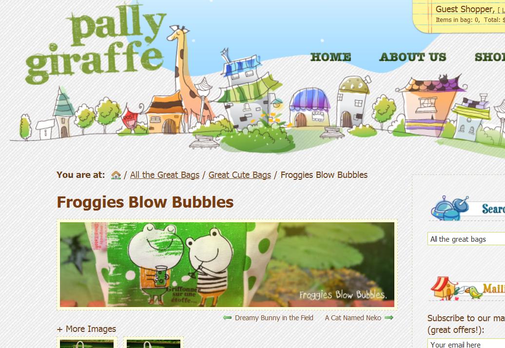
I have an example for you. I’ve been working on a couple of cute websites with designer Jeff Wain. At one point, Jeff sent me a link to the majorly cute site whose screen capture you can see at the top of this post.
It didn’t work as an inspiration for the preschool site we’re working on, as he had thought it might, but it did look like the perfect place for me to buy a little gift I needed.
Here’s their very nice and friendly-sounding page for ordering.

I went ahead to checkout, blithely ignoring the “terms and conditions” because, what the heck, I was just buying a little something there and they seemed trustworthy. I clicked on their link, sure, but I didn’t scroll down the page. I glanced, concluded that they were talking about privacy and copyright, and clicked back. I think that page got four seconds of my time.
Had I actually scrolled down and read that page, as they wanted me to, I’d have seen this section clearly explaining that the company only ships to Singapore, and that the dollar sign refers to Singapore dollars:

I didn’t. I completed my transaction. I was amazed at the low shipping costs that showed up as I checked out, and amazed also when — after the transaction was completed — I discovered that a favorable exchange rate made my purchase even less expensive than I had thought it would be.
What’s more, I told all my girlfriends about this great place with extremely cute gifts and what a bargain they were. I might have posted the link on my Facebook page.
In order to avoid unnecessary suspense, let me tell you that the kind people at Pally Giraffe emailed and told me that they don’t ship to the United States, where I live, but that they’ll make an exception in my case. They could also have refunded the purchase price and not sent my order. I’d have understood. I think I’m going to have to send them a present to make up for their loss on my purchase with them.
Pally Giraffe tells us that they only ship to Singapore, and also tells us to go read that page where they say so. Problem is, I — like the rest of the people who might visit your website — don’t use websites the way the owners want me to. I use them the way I want to. In this case, I saw the product page Jeff sent a link to, the About page, where I read and admired the company’s statement of environmental responsibility but found no hint of physical location, and the shopping cart. I got that present ordered in about five minutes and moved on to my next email.
There are ways to design your site to encourage people to take particular paths through your site, but even if you’ve done that, you can’t count on them. Your visitors are at your site for their own purposes, not for yours, and you’re not there to say, “Hey, you’re not using this website correctly!”
Here’s what Pally Giraffe could do, if they find themselves suddenly inundated with orders from Americans needing gifts for little girls:
- Add their address to their home page and contact page, in hopes that foreigners will check on whether or not they ship internationally.
- Add a statement like “We ship only within Singapore” at strategic points along the path to purchasing.
- Get their IT guy to teach their shopping cart to recognize and reject foreign addresses.
A similar case came up recently with an online bookstore whose website I wrote. They weren’t getting the orders they wanted, even though traffic was great, so I got some subjects and tested the website. The sticking point became clear very quickly: visitors had to register before shopping. This was explained on the FAQ page — where people naturally weren’t going before attempting to make purchases.
While I’m used to the idea of registering before shopping, the testers often descended to helpless clicking all over the page (you know what I mean — if you don’t do it yourself, you know someone who does) before discovering this requirement. Many of them were frustrated by the time they actually reached the registration page, and were no longer willing to register.
Here’s the solution: when you plan your website, plan it with the user journey in mind. Instead of imagining it as a document people read through, try out the different ways people might navigate through it. Make sure your call to action is at every point at which people might decide to take action. Have any important caveats at all the points where people might need them. Put your contact information on every page, unless you really don’t want anyone to contact you.
Oh, and if you live in Singapore, you can find some seriously cute stuff at Pally Giraffe.
Leave a Reply