Your cart is currently empty!
Long Web Pages
How long your web page is doesn’t really depend on how many words you have on it, as you might think.
Many web pages are designed to put everything important above the fold, since most visitors won’t scroll before they commit to reading the page. The first glance part of the page contains all the essential information, as well as the whole design. There may be a simple footer at the bottom of the page to wrap it up, but people who fail to scroll down won’t miss any important visual elements.
Pages of this type may allow the text to continue below the design area of the page. Some people will read all the way down the page once they’ve decided to stay, and search engines will “see” all the text at the bottom of the page and may get a clearer idea of what the page is about than they could get from the part that shows on the typical monitor. Sometimes the text is all contained above the fold; if the designer is smart, there’s 280-480 words, enough to be clear to people and to search engines.
That’s not the only way. In fact, long-format pages are showing up more in web design magazines and portfolio sites. This is not because more people are scrolling down the page, though. So how can you get the look of a long-format page and also have the benefits of the all-above-the-fold page?

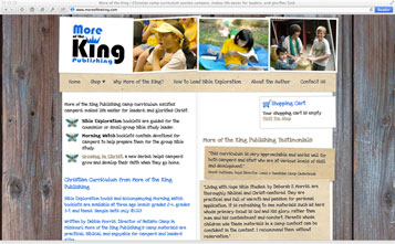
We’re working right now on a new website for More of the King, a publisher of religious study materials for camps. Designer Tom Hapgood has created a long page design for them. As you can see at right, the design is quite long. There’s a header and an equally eye-catching footer, with a background nature photo that makes the whole page look like a poster pinned up on a rustic cabin wall.
This is just the right look for More of the King. Owner Debbie Morris rejected an earlier iteration, saying, “The kids look too clean.” She’s the director of a camp, and she wanted the authentic camp look, not something too polished. Tom thought about scrapbooks and bulletin boards of snapshots at a summer camp, and came up with the perfect design.
A successful long-format page needs two things.
First, you must have the essentials above the fold. A visitor needs to be able to see who you are, what you offer, and how to get it within just a few seconds of opening the home page.
Second, you should have things to draw the eye down the page. While the all-above-the-fold page may allow text and people may read it, a long-format page intentionally has good stuff waiting for those who scroll. This page uses fancy images instead of mere buttons to draw the visitor’s eye down the page, the typical monitor will show the bright letters and a peek of the images of the books for sale at the website, and the testimonials are divided visually to keep people from registering (and ignoring) a simple column of text.
The beautiful landscape and the cute frog are rewards for scrolling clear down the page, and the page is designed to encourage visitors to do so.
by
Tags:
Leave a Reply