Your cart is currently empty!
Masculine Websites
What makes a website masculine? If you try and picture a masculine website, it probably looks like it was either designed back in 1950, or it just wandered out of the desert looking for a cold sarsaparilla. This sort of back in time style is pretty popular with websites trying to capture a male audience, but are a mustache and a sepia tone all that it takes to make a website manly?
I put on my stereotyping cap and tried to think of a few things that could be considered masculine. I settled on bad beer, wood handle axes, and pomade. That sounds like a masculine Christmas wishlist right? For each of these manly items, I searched for a couple of different websites to see what they had in common. The thought was that by looking at websites for masculine items, I would be able to find what makes a website masculine.
Pomade seemed like the only item that was really intended solely for men. There are probably women out there who use grease, but it’s traditionally used by guys. I figured this was a good product to start with. I found a couple of brands, one named Murray’s and the other Suavecito.
The website for Murray’s pomade has all the masculine appeal of a Halloween Oreo. The header boasts the date of establishment, and the website features some pinstripe accenting and distressed typeface, combining to create the illusion of age.

Suavecito made use of huge images, fancy fonts, and skeletons. Nearly every page you click on leads to enormous, screen-filling photographs. It really looks like the company capitalizes on a lifestyle that includes traditional tattoos, hot rods, and groomed hair. Again, kind of a shout out to the past.

The wood handle axes seemed like the next most masculine thing out of my list. I mean, Paul Bunyan was the pinnacle of manliness, and he had a wooden axe.
Gransfors Bruk is one of the most trusted names in axes. Their website features plenty of black and white images of hard work, as well as some boxes that are maybe meant to look like tattered pages from some old manly tome. Or maybe a treasure map. Both are pretty masculine.

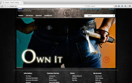
Two Hawks is a company out of Missouri that makes wooden tomahawks. There is little more manly than an antiquated tool. Again, you see big images with Two Hawks, as well as a Springsteen inspired image of a posterior, championing hard work and alluding to patriotism.

This leads us to the beer. Beer is by no means exclusively masculine, although the advertisements often are.
Schlitz is a notoriously average American beer. It’s not a good beer, but it’s not the worst thing you’ve ever tasted. The company is trying to piggyback on the recent success of another incredibly average beer, PBR. The Schlitz website slaps you in the face with a desperate need to be seen as something found in a time capsule.


Natural Light, the world’s worst beer according to ratebeer.com, seems to take a different approach with their website. They aren’t taking the road to machismo, they’re instead catering to the college crowd, who aren’t so much interested in being manly as they are interested in being inebriated. They’re the self-dubbed “official beer of keeping it real”.


Just glancing through these masculine websites, most of them incorporate a large central image, some indication of antiquity, and big stylized fonts. There isn’t a whole lot of color, but when color is used it’s dark and saturated.
So if you’re wanting to make a masculine website just remember this simple formula: old + men’s grooming + hard work = jackpot.
by
Tags:
Leave a Reply