Your cart is currently empty!
Please Google or Please Your Readers?
Google’s recent algorithm update was good for Haden Interactive and for our clients, but it was rough on a lot of sites, and not just content farms. One such site was Good Books for Kids. Site owner Pam Tee is passionate about children’s books, and she shares her excitement with readers in the form of book reviews and reading lists.
When the Google update resulted in a loss of rankings and traffic for her, Pam wrote, “Does one design for Google or readers?”
Pam graciously agreed to let us have a look at her site to see whether we could improve the experience for her readers and make it more appealing to Google at the same time.
A quick note, first: this is a personal website, not a business site, and it is obviously not professionally designed. We’re not considering issues related to this point, but simply looking at the search vs. usability question in the context of a site of this kind. We’re not recommending any changes Pam can’t make for herself.
Pam has a problem with duplicate content. She posts the New York Times bestseller list of kids’ books every week, only adding reading level, and she also has lengthy reading lists which consist only of book titles linking to Amazon, or sometimes include descriptions of the book from Amazon.
The heart of the site is its large collection of book reviews, sorted by topic such as hibernation or good reads for Chanukah. The reviews are thoughtful and original. However, a typical book review has about equal words of review and words of basic information on the book which is essentially excerpted from Amazon’s book description, in content and format.
From the point of view of a robot, probably half the content at Pam’s site is her own content, and the other half is duplicated from other sources. Since Pam’s site is an Amazon affiliate site, most of the outbound links are to Amazon, and a large amount of the text is identical to that at Amazon (titles, some book descriptions, publisher info, etc.), while another large proportion is originally from the New York Times.
The obvious solution is to remove the duplicate content and add more original writing. However, Pam feels that the duplicate content, in its context, is good for her readers. She’s thinking about splitting the site up and moving all the reading lists to another site, which may not be ranked well by Google, but to which she can link from her cleaned-up site.
That’s the background. Now let’s look at the user experience for Good Books for Kids.
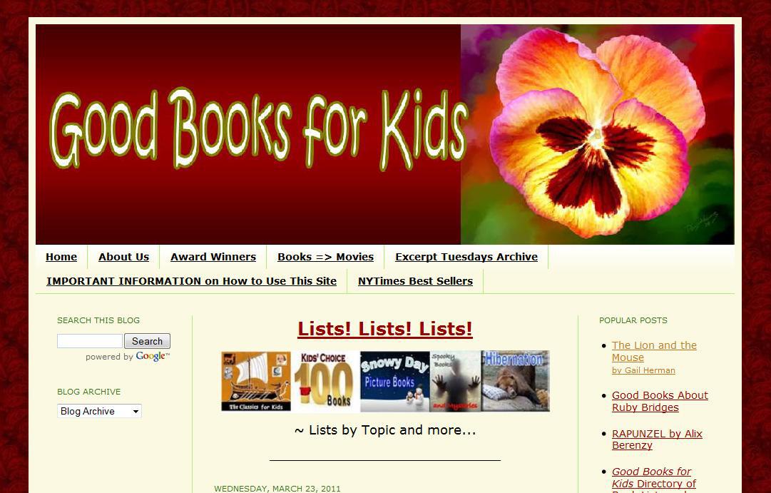
The first look at every page includes a large but not very informative header, the navigation bar (see below), a search box, a static list of popular posts, and a link called “Lists! Lists! Lists!”
I’d change the header completely, if it were my site. It could be narrower, thus allowing visitors to see more of the main content on a first visit. It could use text instead of images for the words, thus giving more information to the search engines. It could have images and words that would tell visitors right away what the site is and does. “Reviews and reading lists for parents and educators” or something of the kind would be useful for search engines and for human visitors alike. An image that could honestly be given alt text like “children’s literature” or “kids’ book reviews” would be beneficial, too.![]()
While visitors can search for books, the main navigation is doing nothing for readers. There are seven main navigation items:
- Home — nothing wrong with that
- About Us — again, a useful page
- Award Winners– a list of links to other lists of awards
- Books=>Movies — a list of links to trailers of movies based on books
- Excerpt Tuesdays Archive — an uncommunicative title which leads to a table of images of book covers, each of which can be clicked to take the visitor to an excerpt of the book on another site
- Important Information on How to Use This Site — this title is too long, and any site that requires instructions for use has design problems; however, this page is actually more information that could go on the About Us page, such as the sources authors use and the reason they link to Amazon.
- NY Time Best Sellers — an explanation of what the NY Times Best Sellers list is, an unsorted list of links to Pam’s repostings of the Best Sellers lists, and a couple of links to articles about the lists.
The navigation ends up being unwieldy enough that it doesn’t fit on one line yet leaves empty space on the right hand side, and readers may not immediately recognize it as the main navigation for the site. Three of the main pages are unadorned lists of outgoing links. Two could be collapsed into the About Us page. Then we have the Home Page and the page about the bestseller lists. In short, none of the main navigation items goes to any actual original content.
Search engines crawling a site take your main navigation as your announcement of what is most important about your website. Pam is telling Google that her website is about outgoing links.
A more standard, recognizable navigation bar would improve usability. It would also give Pam an opportunity to direct her visitors to places they might like to go, while showing search engines what her site is really about.
Pam’s site could be usefully sorted in a lot of ways:
- preschool books
- elementary books
- secondary books
- young adult books
or
- books for spring
- books for summer
- books for winter
- books for fall
or
- reading lists
- book reviews
- blog
Any of these or a number of other sortings would make more sense for visitors than “Excerpt Tuesdays Archive.” I feel certain that few people search for the phrase “excerpt Tuesdays archive” at Google, but Pam is telling Google that this is one of the most important things about her website — important enough to be in her main navigation. Once the search engine reaches the page, there are almost no words there for them to read, and the images are hosted at Amazon and have no alt text. If she really believes that this page is that important, Pam should give it a title like “Book Excerpts” and get some text in there so the search engine can understand what she’s doing on that page (it wouldn’t hurt to tell the human visitors, either).
Next as we travel down the page is the “Lists! Lists! Lists!” link. It takes visitors to a long long long page of reading lists. I’d sort that page out, myself, so that a person scanning the page can tell more quickly what it is and where things are. But the link itself is a problem. It’s an important link to an important page, and it’s on every page of the site. The correct place for such a thing is in the main navigation. There it should have a title that tells visitors and search engines what they will find there. “Reading lists” would make sense.
Once we make the header narrower and more informative, fix the navigation so that it too is narrower and more informative, and get rid of the “Lists!” link, our visitors will be able to see the main content, or at least enough of it to allow them to decide whether to settle in and read it or not.
As of this writing, the current post is the NYT best seller list. Pam believes that adding the reading level and a link to buy the book increases the value of the content enough to make it worthwhile for visitors to come to her site for it rather than to the original source. Google may not agree, but this is Pam’s call. If she has enough original content on other pages at her site, this level of duplication may not hurt her chances with the search engines. She could post only the current list, and remove those from previous weeks, adding the books and her reviews of them to other pages. This would keep her from having such a lot of duplicate content in this category.
 The next category of pages is the collection of topical reading lists with reviews. It’s very useful for parents and educators to have a list of good books on hibernation with excerpts and opinions. However, I’m not at all sure that it’s useful to have the ISBN (identification number), number of pages (very predictable) or publisher. Every book is linked to its page at Amazon, where readers can readily find this information. If some of it is really essential, Pam can at least change the format. That is, she can write, “This 32 page book shows the usual high level of quality that we expect from Candlewick Press.” Removing the Amazon-formatted data or rephrasing it would fix the duplicate content problems at that type of page without lessening the value to readers.
There are also individual book reviews and blog posts about the authors’ book experiences and thoughts about reading, all of which provide original content. Doing more of this would be good. Would it be a good plan to create a new site to house the duplicate content? I don’t really see the value of that; it’s just as sensible to link to the original source of the content directly, as the site does, and to remove the duplicate content if that’s a concern.
Pam could, for example, provide reading levels for the titles on the best seller lists without duplicating other elements of the content, and link instead. She could divide some of the very long lists into more specific lists with introductory paragraphs. She could add text to the pages that consist entirely of links.
Would making these changes be pandering to the unreasonable demands of Google? I don’t think so. I think these changes would actually improve the reader experience, while also communicating better with search engines.
Google’s official position is that they prefer sites with greater value and usability. I see no reason to disbelieve them.
by
Tags:
Leave a Reply