Your cart is currently empty!
Reconciling Analytics and SEO Reports
Dominic Collard sent us a great question about Google Analytics. If you have your Webmaster Tools connected with Analytics, you have access to some useful reports under Search Engine Optimisation:
In the Traffic Sources>Search Engine Optimisation there are 3 reports – queries, landing pages and geography. I’ve never understood why the clicks for each of the three reports show as different amounts; surely they should be the same? For my own website, it’s showing 12 clicks against queries, 65 clicks in the landing pages report, and 75 in the geographic report.
These three reports are very useful, but they’re showing different things. In general, we can say that Google is showing us the number of impressions — that is, the number of times they offered our site to people in search results — and the number of times people clicked on those offers.
However, they’re not showing all the impressions every time.
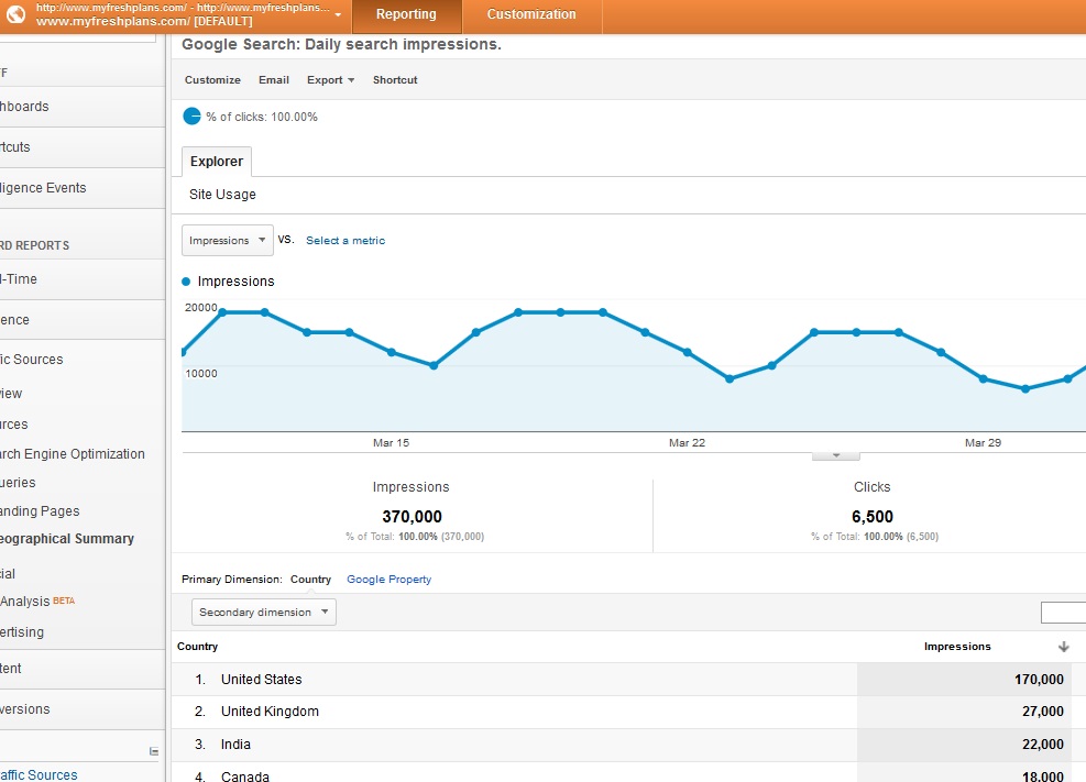
Have a look at three screens from our lab site, FreshPlans.
The shot above shows the Geographical Summary. It’s showing the impressions shown to people in 212 countries in the past month, for a total of 370,000 impressions. We can also see that there have been 6,500 clicks, and that number is very close to total number of visits we’ve had from organic search. The numbers in the SEO reports seem to be rounded — something you might not see if you have smaller numbers.
The shot below, however, is showing the number of impressions of the site’s top 1,000 landing pages. Depending how many pages you have, it might include all the pages on your website. However, since FreshPlans is a fairly large site, this shows fewer than half of the impressions shown in the Geographical Summary above. That summary shows all the impressions, no matter which pages they offered. The Landing Pages only shows our most popular landing pages. It doesn’t for example, show our “Think Like an Engineer” lesson plans or our Bunsen Burner Day activities — these topics are not as popular. However, if anyone happened to search for those subjects, they probably would be shown our pages; thus, the total number of impressions shown above is larger.

Interestingly, the number of clicks rounded to the same 6,500 as in the geographical summary. The numbers were the same in the other examples we checked before answering Dominic’s question — but they were not the same for Dominic. I’m guessing that this is because of the different sample sizes and the rounding. That is, with smaller numbers the rounding doesn’t smooth out the difference — and maybe with larger numbers the differences would show up again.
The last screen shot shows impressions for our top queries. These were the search queries for which Google showed us most often. There’s some overlap with the landing pages. For example, our pages on Pinocchio and Madame C. J. Walker are both among our top landing pages and the top queries.

However, one of the queries Google most likes to show us for is “Robert Bunsen.” Not everyone who looks up Robert Bunsen wants Bunsen Burner Day activities, so we see fewer clicks in this report, and that’s not one of our most popular landing pages.
So why are these reports showing different data? They’re measuring different things.
Do you have a question? Feel free to send it to us at Rebecca@HadenInteractive.com or Rosamond@HadenInteractive.com and we’ll answer you, either personally or in the blog.
Comments
4 responses to “Reconciling Analytics and SEO Reports”
-
Thanks so much for taking the time to answer my question, and that certainly explains the difference between geography and landing page numbers. I’m still though a little bit flumoxed; here’s what’s hurting my brain.
It has been explained to me, as you have noted, that the query report lists only the top 1000 queries, so hence doesn’t show all the clicks, and hence the lower number. But on what basis is ‘top’ defined?
Wouldn’t the queries that generate at least one click show up before those queries that didn’t generate any? Instead, for March for my account, the queries report shows two queries with 100+ impressions each at top, one with 16 clicks and the other with 5 clicks, and then 33 lines of queries that all returned 5 impressions and no clicks. Is it that the ‘missing’ clicks (ie those that appear in the landing and geography reports) have been generated by queries that had less than 5 impressions, and hence don’t show on the table? So in that case ‘top 1000, is defined by impressions.
-
“Top” is from Google’s point of view where the queries are concerned — it’s the queries for which they most often show you. This depends on things like the number of people who search for a term and what else is out there, not on clicks.
-
-
I am experiencing the same issue with my website (www.redhoop.org) either 5 clicks or zero click. Saw another user posted on Google forum with no answer yet. Any insight on this issue is appreciated.
Michelle
-
I think if you look at all the SEO reports together, you’ll see the way they fit together to give you the complete picture. It’s definitely harder to get clear info with smaller amounts of data.
-
Leave a Reply