Your cart is currently empty!
Visitor Flow in Google Analytics
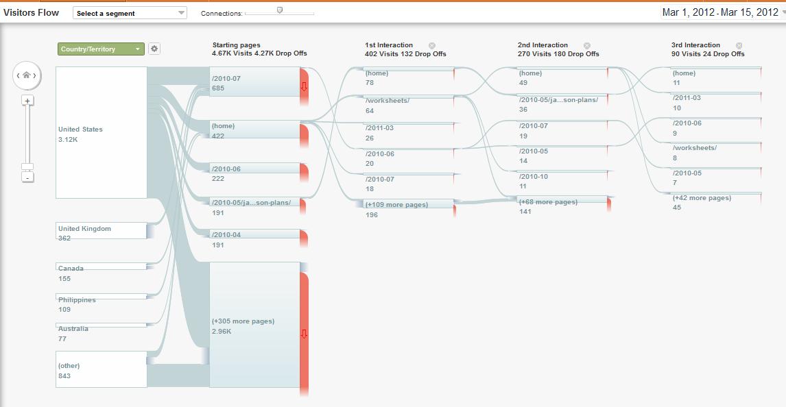
One of the underused tools in Google Analytics, for most businesses, is the Visitor Flow tool. You’ll find this under “Audience” in Standard Reporting, and it begins with a nice diagram like the one at right.
This is from our lab site, FreshPlans; one of the reasons we built it in the first place was so we could show you our analytics. However, FreshPlans has an unusual Visitor Flow chart, compared with the typical business website. FreshPlans is a site filled with lesson plans for K-12 teachers, and doesn’t have the pages a typical business website has.
Let’s scrutinize it anyway, to get to know the tool, and then we’ll discuss some more typical examples.
Reading from left to right, we begin with the countries of origin. We see that a lot of people are going to posts from 2010/07 (we were doing a series of fairy tales that month, and that’s always one of our most popular topics), a fair number visited the home page, and most checked out hundreds of other pages — without significant differences from one country to another. We can also see that most visitors went just to one page. Since FreshPlans is a blog, people arrive via search at many different pages, and typically are just looking for the particular thing they searched for: “Jack and the Beanstalk” lesson plans, for example, or lesson plans on logic.

Next we can see where those visitors who chose to continue to another page went. In this case, the two most likely places for visitors to go are the home page and the Worksheets page. Probably the most useful thing we can see here is that visitors to the Jack and the Beanstalk page are more likely to go on to the homepage than visitors to the various stories we posted in July 2010. We could examine this post and see what there is about it that might encourage visitors to explore further instead of rushing right off to class. Then we could do the same with our other fairy tale lesson plans, encouraging our visitors to stay longer.

A t a business site, we usually see a very different path. The anonymized image below shows what we expect to see at a typical lead generation site. Most people begin at the home page. A few visitors are ready to request a quote immediately, and some are almost ready, so they choose About Us. Most people, however, want more information about the products, or choose to contact the company.

Those who make contact leave the site; they’re through. Those who wanted more information (Products) or reassurance (About Us) go on.
At this point we begin to see a couple of different kinds of behavior. We have shoppers, who go back and forth between the home page and the products page. They don’t need to — while some sites are set up to require a lot of clicking back and forth, we made this one smooth and simple in its navigation. Some of these people may leave to discuss the purchase with someone else or to think about it, some may make a phone call, which is not traced, and some may decide not to buy.
We have buyers, who go from the products page to About Us for reassurance or to the home page one more time and then request a quote or make contact. We also have researchers, who read the case studies and continue on further beyond the chart. We can follow these visitors further and see all the pages they read before they left the site.
This kind of visitor flow shows us the normal patterns of interaction with our site. It shows us the decision points for our visitors, and the places where we lose them. It can give us information about strategic opportunities. If you haven’t looked at yours, check it out.
Leave a Reply