Your cart is currently empty!
Redesign: A Financial Services Website
Northwest Arkansas financial planners Beale, Lee and Associates are rebranding their company. They’ve had significant growth and quite a bit of visibility with an ongoing radio show, major press mentions, and a forthcoming book by one of the principals. Headquartered as they are in the home of Walmart, they serve a prosperous clientele, and they have big plans for the future. They also have a new name and logo.
It was definitely time to update their website.
Their old website, which you can see below, had a lot of good content, but there wasn’t a clear path for visitors to take through the many homepage offerings.
This is a common problem. We like to imagine our visitors settling down to read the entire home page and making a leisured choice about where to go next, but that isn’t how people generally use the internet. Instead, they take a few seconds to determine whether your website has what they need or not. If they can’t find what they’re looking for, they’ll probably leave.

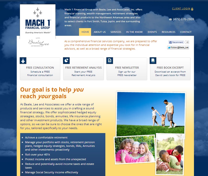
Tom’s new design, shown above, includes plenty of good stuff — see more screenshots below — but in a new, easier to grasp format. The main calls to action are at the top, with a clear, simple site navigation bar.
Visitors who are intrigued but not yet ready to take action are drawn down the page by visual elements that make it clear that there’s more to see further on.
They’re rewarded by video, recent blog posts, tweets, clickable information about the company’s products, event announcements, and more. See the below-the-fold below left.
The overall effect of the home page is of an exciting place worth coming back to visit again, a vibrant company with a high level of expertise and community involvement — but without any feeling of clutter or confusion. 
This is basically the goal when you have a lot going on: a sense of richness, not of clutter.
We’re using the blue of the new logo, which references the site owner’s history as a fighter pilot, and adding clouds in the background for the same purpose.
Another big change is in the video. On the old site, the video began playing as soon as the page was opened. By and large, web visitors prefer to choose whether and when to watch videos — especially if they’re sneaking a peek at your website at work.
The video on the new site is smaller, but it’s easy to click through to see more, and video is used throughout the website. We’ve added an interactive map, a snazzy new event registration system, and an easy-to-find client login feature.

The old website had no blog. There was an external blog, but blogging on your website has more SEO and conversion benefits. We’ve included a blog at the website — the main blog page is shown at right — and added pictures to make the posts more visually appealing.
The look is fresh, new, and upscale. It’s a better representation of the company and will grow with them.
Does your website need an update? You might not be rebranding your company, but you might still have outgrown your old website. Call us at 479.966.9761 if you’re not sure, and we’ll help you decide.
by
Tags:
Leave a Reply