Your cart is currently empty!
Winning Web Design
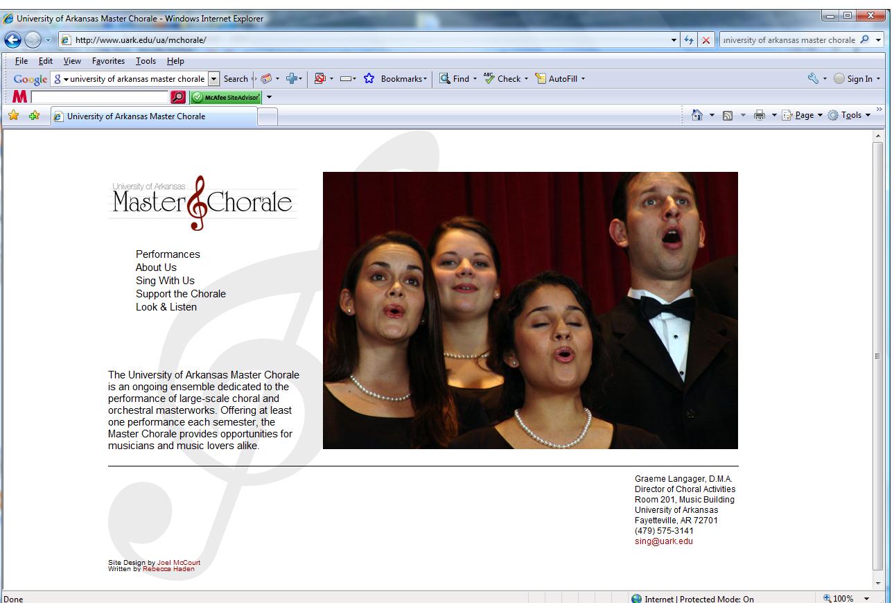
A new website for the University of Arkansas Master Chorale went live a couple of weeks ago. I wrote the copy for this website, and worked on it with the web design class at the university. Each of the students created and coded a design, and director Graeme Langager and I chose one for the new site. Dr. Thomas Hapgood, the prof for the course, described the design we chose as the “winning” web design.
This was true in the sense that there were competitors for the opportunity to have a design published online — a great way for a new designer to start a portfolio. Joel McCourt, the designer of the final version, doesn’t yet have a website or an online portfolio, but he can refer prospective clients or employers to this design. That’s a nice prize. I assume he also got a good grade.
But it’s also a winning design in the more general sense of being a really good design.
What characteristics make Joel’s design a winner?
First, I have to say that I enjoyed working with the class and seeing all their designs. I hope to see more of their work in the future. The process for choosing the design for the website was simple, though it wasn’t easy to choose just one.
Out of all the designs submitted, I narrowed it down to the ones that were the most user-friendly.

Ashley Keirksieck created this design. The navigation is clear, the look is elegant, and visitors can easily find what they’re looking for. The pale gray background provides almost the same degree of contrast and readability as black-on-white, with the luscious color on the banner giving a bright and elegant look.

Corinna Aguilar went with a more daring color scheme, but kept readability with high contrast in the text area. She used arresting navigation buttons to help visitors find their way around.

Tim Graves used horizontal navigation across the top. Since people are accustomed to looking for the vertical left-hand bar, or for the horizontal top bar, either choice works well. Again, dark letters on a light ground give us good readability. Since the audience for this site includes older people, this was a particularly important characteristic.

Julie Lungaro created a more modern look, but again the navigation is very clear and the text is highly readable.
From these options, Dr. Langager selected McCourt’s, with Kiersieck’s design as a second choice. His reason was “the overall cleanness.” Joel’s design has the most basic elements, with a rhythm and movement that make it elegant rather than just minimalist. The decoration of the pages supports rather than competes with the images and words.
Cleanness is a quality highly prized in websites. We went through a spell of being all impressed by the fanciness possible in websites, but that time is past. Modern users spend a matter of seconds at a page determining whether it contains the content they’re looking for. They may then settle down for many minutes or even hours if they’ve found what they want, but the initial demand is for an uncluttered page where the eyes can light immediately on the information sought.
The reaction from the chorale? In the words of a board member, “Awesome website! You rock!”
Thanks once again to Dr. Hapgood, Joel McCourt, all the students who participated, and webmaster Philip Shane Richey for their hard work on this deserving project.
by
Tags:
Comments
2 responses to “Winning Web Design”
-
Very nice! Yes, I admire cleanliness in websites. The cluttered ones overstimulate me and I have to leave.
-
thanks for the sharing nice info
Leave a Reply