Your cart is currently empty!
Blue Websites
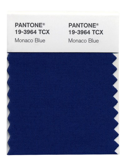
Here it is, a Top Color for 2013: Monaco Blue. The blue (presumably) of the sea off of Monaco, the blue of a film star’s eyes, the blue of approximately 527 million websites.
I made that number up. However, unlike 2012’s Tangerine Tango and 2011’s Honeysuckle Pink, it will certainly be no challenge to find plenty of websites using the new year’s official Color.
Why are so many websites blue?
The most likely reason is that blue is the most popular color in the world.
Another possible reason is that blue was strongly associated with computers. The first ones were black and white, and there are still plenty of black and white websites, and then there was the horrible neon green which makes people shut their eyes, and that is clearly not the effect we want with our websites.
In 1981, the first color monitors came along, with a palette of colors including that kelly green, bright red, black, magenta, and Dark Yellow, which has been a pretty trendy color recently but was considered so ugly in the 1980s that machines were programmed to turn it into a yellowish brown, which people apparently preferred.
Perhaps the best color in the mix was blue, as in the Blue Screen of Death, which was what you saw when your computer crashed, which used to happen a lot. Here, courtesy of Wikipedia, is the Windows XP Blue Screen of Death:
.svg")
Not quite Monaco Blue, and not IBM blue, either, but pretty close.
Facebook, Tumblr, and a whole lot of college and sports sites use a deep blue that is at least reminiscent of Monaco Blue. We’ve done lots of blue sites, but we tend to go brighter and lighter, though the last one in the series looks close.


Will we see more deep blue next year, or will this be one trend that doesn’t make much difference to web design?
by
Tags:
Leave a Reply