Your cart is currently empty!
Accessibility and Visibility for Your Website
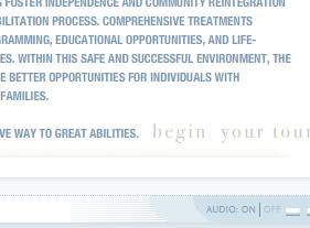
The website at right, a Before site, is directed toward people with disabilities. The one below is the Before site for a company whose target market is older adults.

See any problems?
If you don’t, then you’re a young (or relatively young) person with good eyesight. The pale blue website at the top, and the purple-on-purple one above are both hard to read for everyone else.

Compare the first two examples with this one. Here, black text on a white background gives maximum contrast and there is even a feature allowing readers to increase the font size.
Nowadays, I hope we all understand the importance of making our web designs as accessible as possible, using standards-compliant code so that people using special adaptive technology can use our pages just as those using common browsers can. But sometimes we — at least those of us who are young and have good eyesight — forget the very basic idea of high contrast.
White on black is always a safe choice, but any strong, dark color on a pale color can do the trick. Unless you’re quite sure that none of your customers have any issues with vision, including simply being older, you’re better off keeping your important stuff in dark text on a pale ground.
Ignoring that suggestion can mean sending your limited-vision visitors away to your competition very quickly — long before they’ve had a chance to buy something cool from your cool website to give to their grandkids.
by
Tags:
Leave a Reply