Your cart is currently empty!
Google Analytics in an Infographic
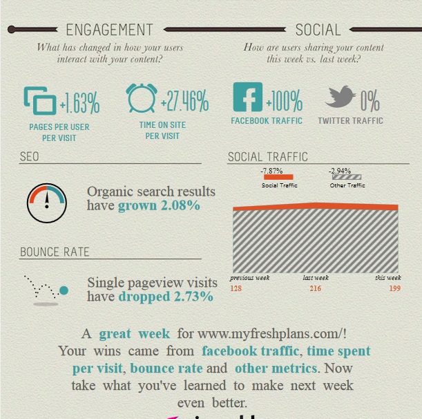
This nice infographic is the result of a new service from Visual.ly: your own personal Google Analytics infographic.
Once you sign in and give permission, Visual.ly will pull data from the past week at Google Analytics and populate the fields in the chart for you.
Here’s what’s included in the report:
- Week over week visits. You’ll see the increase or decrease in traffic over the past three weeks in raw scores, a cute little chart, and percentages.
- New vs. returning visitors. You’ll see the percentage of each, as well as the increase or decrease of both.

- Engagement. You’ll see a couple of data points which have changed over the past week: pages per user and time on site. These are not the only metrics that deal with engagement, but they are good basic information.
- Social traffic. You’ll see the overall increase or decrease in social traffic, plus the change in Facebook and Twitter in particular.
- SEO. You’ll see the increase or decrease in organic search traffic.
- Bounce rate. You’ll see the increase or decrease in your bounce rate.
- Congratulations! You get a cheery little message telling you how great things are.

Actually, we were able to look at plenty of examples, so I can tell you that you might see not just the “great” and “amazing” messages here, but also commiseration that “it wasn’t the best week, but you did do well on…” and “Uh oh! What happened?” followed by a hope that you’ll be able to take the data presented and turn things around (that last was for a site which was down last week).

You can download your report, and you can sign up to have these reports sent to you weekly.
Now, You can also have Google Analytics reports sent to you weekly. 
The image at left shows the basic Google Analytics weekly report from our lab site — the same site that got “a great week” message from Visual.ly above. It contains all the data that we see in the Visual.ly report, and then some, and is equally clear, if less cute.
What’s more, you can set up reports of exactly what you want to know. For example, you can check page speed, conversions, and percentage of mobile visits if those metrics are as important to you as traffic and engagement.
On the other hand, the more complex your reports, the harder they may be to grasp at a glance. And of course, the most interesting information always requires you to notice a surprising piece of information and dig more deeply into the data to see where it’s coming from. That’s not possible with a weekly report.
If you find analytics intimidating, though, getting simple reports with cheery messages might be more appealing.
Visit Visual.ly in any case, if you’re interested in visual representations of data — or fun graphic toys to play with.
Leave a Reply