Your cart is currently empty!
How Fun Should Your Website Be?
Marshall Farrier wrote that it’s important to have the correct levels of fun at your website. “Weaknesses in the fun department can result either from over-emphasizing its importance or from neglecting it entirely,” he cautions.
My first reaction to this was consternation. How could you have too much fun? But Marshall is defining “too much fun” as so much flash and splash that you can’t find your way around the website.
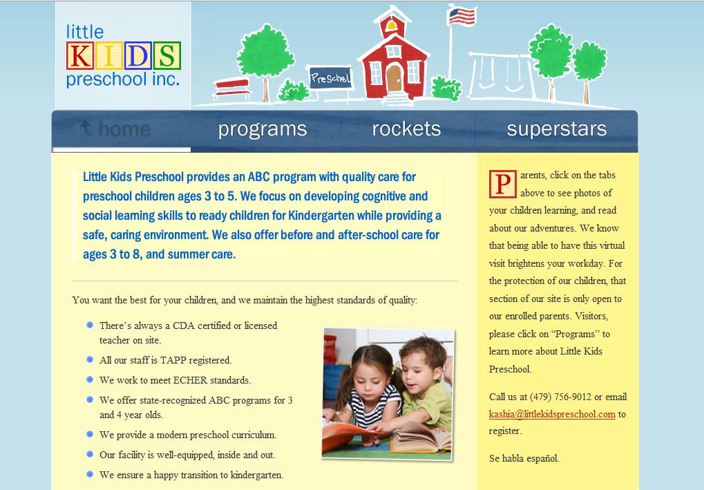
Good point. With this in mind, I looked again at the new website designer Jeff Wain and I made for Little Kids Preschool, Inc., searching diligently for signs of excessive fun.
The site certainly is fun. The header replaced an earlier, more playful one, combining an academic air with a reasonable level of playfulness and fun. The letter blocks in the logo and the drop cap on the sidebar paragraph (it’s repeated in the class blogs, too) add a special touch. A happy picture of children, fun bullets on the list, and bright colors add to the sense of fun.
And yet the navigation is sensible, the content is professional — even the children in the photo appear to be comparing a couple of sets of data in support of some philosophical argument.
No, this website is not excessively fun.
Jeff Wain was the designer on this project. The other site Jeff and I made, for A Plus Educational, is also very fun.

That’s an animated worm, there, peeking out of the apple over and over. Those are, I can’t deny it, dogs in costumes. The navigation is unusual, and you’re always taking a bit of a chance with that.
However, it’s a simple homepage for an enormous catalog, and the point of it is to convey the fun feeling people get when they visit the A Plus store. This site would be erring on the side of excessive fun if it were for a law office, but for the company in question I think it’s just right.
Let’s consider one more example: the Liquid Dispatch, Inc. website Tom Hapgood and I made.

This is a chemical transport broker, a company that arranges backhauls of petroleum and liquid fertilizer and feedstocks. It is not, like a preschool or a toy and school supply store, an obvious candidate for a super-fun site.
Yet Tom’s design seems to me to have quite a bit of fun going on. We’ve got shiny textures and movement and bright colors and a zooming tank truck. We’ve also got clear navigation and terms like “bonded, licensed ICC broker,” which does not suggest madcap frolics to me.
Do you agree with me that all three of these designs hit the right fun level? How about your own?
by
Tags:
Leave a Reply