Whether your site is ready for mobile or not, chances are good that visitors are seeing it on mobile devices.
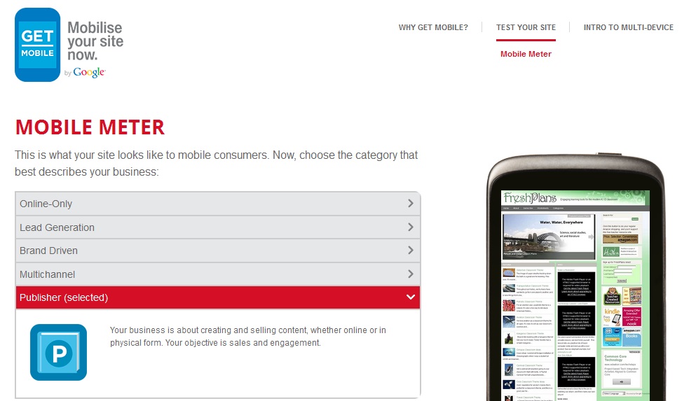
Google’s new site tester shows you how your site looks on a smartphone. Click the link, fill in the web address of your site, and you’ll get a screenshot, plus the load time and some questions to think about.
Our lab site, shown here, has blank spots where the videos belong, and a longer load time (8 seconds) than we’d like. It isn’t a responsive design, so it’s not easy to read or navigate on mobile. When we answered the questions, it got the same score as an elderly site for which we recently updated content, even though that site is obviously broken in its smartphone screenshot.
Some sites we tested show the site in miniature, as FreshPlans does, Some were messed up, with navigation pushed around and pictures outside the frame. Some showed a different, mobile version of the site. They all got about the same score for mobile-friendliness, but some of the screenshots were a surprise.
Say your website doesn’t make you happy when you test it. What should you do? The GetMoMeter will show you a list of UK web designers who’ll fix you up, and of course we’ll be happy to do so as well. Do you need to?
First step: check your analytics.

The shot above shows you where to look in your Google Analytics for information about your mobile visitors. We can see that the broken site we mentioned gets less than 3% of its visitors via mobile devices. FreshPlans gets about 5%, mostly on tablets. One of our client sites gets more than one third of its traffic via mobile devices, with the iPad topping the list but a dozen different phones making up the bulk of the mobile traffic.
These three sites might make different decisions about whether to have a mobile redesign now, or to wait. The site with 33.9% of its traffic from mobile devices has to look good on mobile right now (it does). The site with 2.8% mobile traffic might wait till its next redesign. FreshPlans looks pretty good on tablets, but 5% is a large enough number of visitors that we should look further — if you saw those numbers for your business site, you’d certainly want to do so. Here are some questions you should answer if you need more information before making a decision:
- Is there an upward trend? At FreshPlans, the mobile traffic is increasing — 5% in the past month compared with 0.53% a year ago. The percentage is still fairly small, but certainly worth watching.
- Do conversion rates differ? FreshPlans is a public service, but we set up goals at Google Analytics for testing purposes. Our mobile population shows a 41% conversion rate, compared with a 29% conversion rate for the desktop visitors. If our analytics goals were tied with business goals, we’d need to make sure our site was as mobile-friendly as possible.
- Does visitor behavior differ in other ways? FreshPlans mobile visitors stay on the site longer. This may just be because of the slow load time, since they visit the same number of pages. If your mobile visitors check out fewer pages, have a higher bounce rate, or follow strange paths in their visitor flow, that’s evidence that the mobile experience is lacking.
- Does your business rely on mobile web use? If you own a restaurant, don’t mess around. People look up restaurants on their phones, and if yours looks bad, you need to fix that posthaste.
Considering these factors will help you decide whether to prioritize mobile site improvements.
A final word, though: these questions are just about whether you need to get your site mobile friendly right now or can put it off until your next site update. Websites need regular updates and redesigns every few years anyway. Next time you have it done, make sure your site is mobile friendly. This is a trend which will reach you soon even if it hasn’t yet.
Leave a Reply