Your cart is currently empty!
My New Favorite Design Book
One of our current web design projects is being enriched by a client with absolutely no design sense at all. The experience is a little like this, but much more fun, because the client is a fun person.
The thing is, we can usually show the client a new design and expect those oohs and ahs showing that the client, while he or she might have been okay with that ugly old design from the past, can now see how much better the new design is.
Not in this case. This is a client for whom things like balance, rhythm, proportion, and good taste are irrelevant. He may have paintings of Elvis on velvet on his walls at home. And that’s fine. We love this guy, We want him to be happy, and if it makes him happy to have images stuck randomly onto his site —
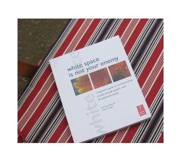
No, I’m lying. We can’t do that. We couldn’t sleep at night if our website turned out ugly. So I want to add the book White Space is Not Your Enemy to the list of books I’d like to give clients. (The other book on that list is Don’t Make Me Think, in case you were wondering.)
This book is written for beginning designers, and in fact probably for design students (the authors are teachers, and the chapters have assignments in them). But it’s all about eye training. And mind training. It has scads of good examples of design, and some bad ones, too. It lays out the rules for making images and words look good together, and has some thoughtful discussions on how to break those rules.
In the very first chapter, is has a list of things good design should do:
- capture attention
- control the eye’s movement across the page or screen
- convey information
- evoke emotion
Isn’t that great? Your website should capture people’s attention and make them want to stay instead of clicking right back to the SERP. It should help them find the call to action, and also the information they need and want; in fact, it should guide them unobtrusively through the user experience you have in mind for them. It should contain that information they need and want in a readily-available form. And it should give them the feeling your company gives your customers.
The book includes explanations of things like contrast, balance, and movement. It answers questions like, “How do I know where to put my stuff?” It explains why centering everything isn’t as good a move as you thought it was. It explains how to send graphics to your web designer, and what all that stuff about different browsers has to do with you and your website. And it does all of this in a friendly, easy format with lots of nice pictures.
If you’re toying with building your own site, or you update your blog yourself, then this book will be very helpful to you — you might even want to do the assignments. If you just didn’t spend as much time in art galleries in your youth as you should have, and you often get the feeling that other people are seeing things you don’t when they talk about how your suggestions would mess up the design — well, this book will give you some insight into what they’re thinking.
I won’t really be giving this book to the client in question, any more than I give Don’t Make Me Think to people who don’t grasp the concept of usability. I love my clients just as they are. But I feel better for having gotten this off my chest.
by
Tags:
Leave a Reply