Your cart is currently empty!
Reading Your Google Analytics Reports
When I write about Google Analytics, I generally write as though you were going to your own analytics account and reading the data there. However, many business owners receive a report.
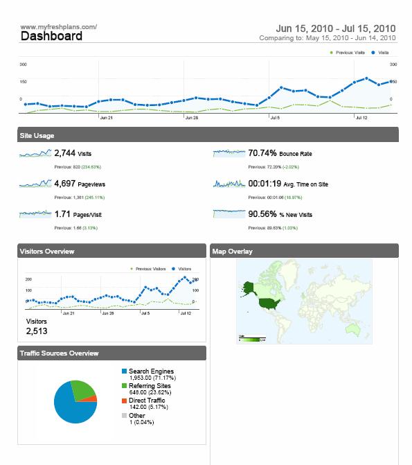
Your webmaster or SEO professional chooses the elements which are most useful for you and instructs Google Analytics to prepare a report, which can be exported as a PDF or as data in a spreadsheet. The shot above shows what the PDF report looks like.
Lets examine it in more detail.

The top half of the page tells us about the visitors. The blue line shows the past 30 days and the green line shows the 30 days before. This is the default option; you might get reports showing different lengths of time. A glance at the line graphs for traffic show that traffic is increasing steadily, which is what we like to see. We can look more closely for more specific information, and other patterns might prompt us to check for other details, but in this case we just see a fairly new site getting increasing amounts of traffic.

Here’s the section between the two line graphs. Reading down the left-hand column, we see that visits have increased by 234.63% and pageviews by 245.11%. This means that the total number of visits to the site increased significantly. Pageviews counts the number of times individual pages were seen, and that also has increased. Below that we can see that the average number of pages visitors look at has increased slightly.
The right-hand column starts with the bounce rate. When visitors look at only one page and leave, they “bounced.” Almost 71% of our visitors look at just one page and leave. We usually like to see a bounce rate of 40% or lower. This site is a blog, so it’s normal for people to come look at one page — the page, typically, that showed up in their search results — and to leave. Still, we’d like to see people stay and explore. Our bounce rate decreased by about 2% since last month, so it’s going in the right direction, but that’s something we should work on.
Below the bounce rate is the information for the average length of time people spent on this website. It was just over one minute, an 18.97% increase over last month, but we’d like to see that number increase. The last metric in this section is the percentage of new visits: over 90%. This is a new site, and the traffic is increasing rapidly, so we’re not alarmed by this, but we do want to see more returning visitors in the future.

The bottom half of that first page shows us the number of unique visitors. We see that this site received 2,744 visits, but there were 2,513 visitors. This shows that some people came back more than once. The bottom half of the page also shows that most of our visitors came from the United States. It also shows an overview of our traffic sources: the overwhelming majority of our visitors came through search, with referring sites the next more popular method, some direct traffic, and “other.” Google says that “other” simply means that the database is full and Google wasn’t able to report all the data. It’s widely believed that “other” traffic is from email or ad campaigns; this site isn’t using email or ad campaigns, but people may be sending one another links to it.
We can get more detailed information in reports, too. If your webmaster or SEO professional feels other reports may be helpful, or if you ask for them, you can get reports covering any of the data in analytics. In this case, we might want to look more at our traffic sources.
This is a report on traffic sources:

The report shows the places traffic came from during the past month, compared with the previous month. In the detail below we can see that direct traffic and referral traffic represent a lower percentage of the traffic this month than they did last month. That doesn’t mean the number of visits has decreased. It simply means that visits via the search engines have increased more than the other types of traffic.

Overall, this means that our SEO efforts are going well. We like to see increasing results from search. However, I usually aim for a more even distribution. With fewer than one quarter of our visits coming from referring sites, it’s clear that we could use a good linkbuilding campaign.
Another section of the report shows the keywords people used to visit: the search terms they typed in at Google which brought the site up for them.

We can see that “classroom theme” is a good keyword for this site, and we should keep using it.
Obviously, I wouldn’t show you analytics for someone else’s site, so I am of course the owner of this site. I don’t really send myself reports. If I did, though, I could read this report and conclude that I needed to make some changes to encourage my visitors to spend more time exploring the site and to come back again. I would also want to do more linkbuilding in order to get an increase in referring traffic.
If your reports don’t make sense to you, ask the person who sends them to you for help in understanding them, or ask here in the comments. If they don’t contain all the information you want, ask to have other metrics included.
by
Tags:
Leave a Reply