We’re working on quarterly analytics this week, and we’re exploring a new report in Google Analytics: Treemaps.
One of the great things about Google Analytics is the way they provide quick visual captures of information which can otherwise take a lot of work to unpack. Treemaps does this primarily for Adwords ads.
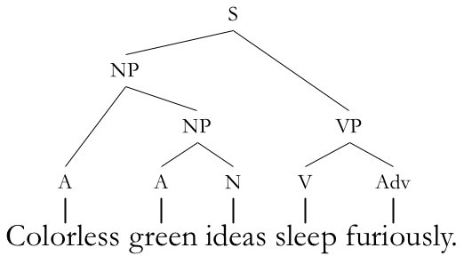
I had expected Treemaps to be data trees like the ones used for linguistics, which you can see at right, but in fact they are nested rectangles. You can choose a pair of metrics to examine, and the Treemap will clearly show the relationships between them. In the first example below, we can see the top sources of the first metric, Goal Completions, delineated according to the size of the rectangles. For this account, as for most, Organic Search brings the largest number of Goal Completions. Next comes Paid Search, then Direct traffic, and so on as the rectangles get smaller.
However, the color of the rectangles also has information for us. You can see the legend at the top, ranging from bright Aladdin green, the best performance, through mint, shell pink, and on to carnation pink — the worst performance. Each rectangle shows a different color, according to the Goal Conversion Rate for the traffic from that source. In this case, we can see that Organic Search brings the largest number of conversions, but not at a very brisk clip. Ads, including both Paid Search and some Other ads, along with Direct traffic, show green rather than the neutral pale pink of Organic Search.
It’s clear that for this account, the specialized ads are doing a good job. Direct traffic normally has a higher conversion rate than Organic Search, since it consists largely of people coming back to your website intentionally, and the Paid Search is doing just as well as Direct, with a bit more volume.
We might choose to analyze the Other ads and determine why the overall Paid Search conversions aren’t meeting the same rate. It’s possible that some small changes would pay off here.
There are more metrics to check. In the example below, Paid Search is a small segment of the Sessions, but it shows a higher Session Duration. So there are many visits from other sources, but the people who click through ads stay longer.
Hovering over the rectangle lets you have a quick look at the top-level data, and you can click through to learn more.
Our first two examples had only pale pink and various greens. The example below shows some poor performance for Session Duration. For this account, Organic Search is both the source of the most Sessions and also shows the longest Session Duration. Social visits not only bring the fewest visits, but also the shortest Sessions, as indicated by the deeper pink.
In the example below, Referral traffic stands out for the smallest number of pages visited. It’s worth checking the path for Referral traffic to see what’s up. Perhaps there are links out there which send visitors to a page that isn’t useful for them — or, of course, to the single most useful page for them, so that their question is answered there and they leave. If a set of pages can be identified, it could be worth adding some content to those pages that will encourage visitors to check out other pages, too.
While the Treegrams are intended for Adwords reporting and will give more granular data than shown in these examples, they might still be useful for accounts that don’t use paid search. For example, the account below shows that most new visitors come through Organic Search. However, those new users who come directly have much higher conversion rates, and even the smaller numbers of Social and Referral visitors are more likely to convert than those who come via organic search.
The new visitors who come directly may be responding to offline marketing efforts, or word of mouth (how memorable is your URL?). While not all the information will be available in analytics, it’s worth making an effort to get some more information about them.
It’s also clear that social media and linkbuilding are worth an investment. Looking at the online behavior of these green groups could give actionable information for the site owner. Some questions to ask:
- What’s bringing the Direct traffic (remember that sometimes this is mobile traffic using search)?
- What about their experience is different from the Referral traffic and Social traffic?
- Could these factors be changed to increase the goal completion among Referral and Social visitors?
- Could the volume of Social visits among New Users be increased?
Treemaps won’t let you look at all metrics, but it may direct you to some patterns you weren’t aware of.


Leave a Reply