Your cart is currently empty!
Visual Clutter at Your Website
Does your website suffer from visual clutter?
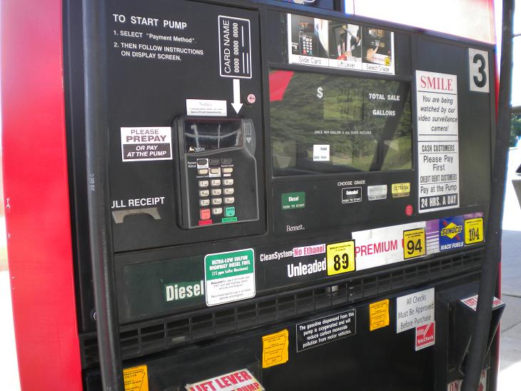
This gas pump sure does. There are so many options here that the user has to stand and stare to figure out what to do. There are a lot of things that look as though they might be things to press in order to pump gas. There are lots of written notices in random places. There are instructions, including a big red eye-catching “SMILE,” which turns out to be not an instruction but a warning that the user is being filmed on a security camera.
There are all sorts of colors, different fonts, words going vertically and horizontally, stickers covering up words, keypads, levers, and even photos. While it is conceivable that the goal here is to distract the user from the actual price of the gas, few of us will be in the mood to read all the various notices, warnings, and threats.
In the picture below right you can see that there are actually instructions on how to use the machine. On the left, there are directions for starting the process: “TO START PUMP 1. Select ‘Payment Method’. 2. THEN FOLLOW INSTRUCTIONS ON DISPLAY SCREEN.”
 If you aren’t too distracted by the bizarre punctuation, you can then stare around in search of a display screen, and find three more steps, shown at the right hand side of the image here: “Slide Card Lift Lever Select Grade.”
If your version of a common machine requires instructions like these, you have a design problem.The owners of this machine should remove all the junk and start over.
If your website looks anything at all like this, you should remove all the junk and start over. If you feel that you need instructions on your website, if in testing you find that people aren’t using your site correctly, if you have multiple colors and sizes of words in a vain attempt to show people what the important things are — then you have visual clutter problems.
Remove all that junk and start over.
by
Tags:
Comments
2 responses to “Visual Clutter at Your Website”
-
I’m just de-cluttering my website now. It’s getting a fresh, just out of the shower make-over as I type! So I was interested in your post, of course.
I love the comparison. And you didn’t even get into the gas stations that also have a television on (!) at the pumps. WOAH.
-
Think about reducing the number of tabs so they’ll fit in a single row across the top of the site, and maybe adding a header that tells what you do at a glance. Looks like a useful service!
-
Leave a Reply