Your cart is currently empty!
Want Lots of Stuff on Your Homepage?
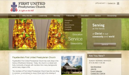
Shan and I are currently working on a church website. There are lots of interesting things about this project, as there are about every project, but one aspect that has been a creative challenge is the desire of the owners to put lots of stuff on the homepage. You’re seeing about half of the page in the mock up above.
Not all clients want to put lots of things on the homepage. Some clients want to put nothing but a big image and an “enter” button. Both extremes call for extra creativity.
A normal amount of stuff for a homepage, in case you’re wondering, is five to seven main navigation links, an image or two, and 280 to 480 words. If that’s what you want on your homepage, you can sit back and relax as your stylish new site is crafted.
If you want 15 links and 1280 words plus 17 images, it’s a bit more complex. But it can be done. Here are some of the methods we use to put plenty onto the homepage:
- Drop-down navigation In the example above, you can see that the main navigation is supplemented by drop-down menus that appear on mouseover. This is often better than extra navigation elsewhere on the page, because it prevents confusion in visitors who want to make quick decisions about where to go next. In this case, the drop-down menus are in addition to extra navigation options, and allow us to put more navigation in without making the page too cluttered or daunting.
- Call outs Extra navigation in this case has special headers to catch the attention of people browsing the page. Tom did this with the site shown below, when they wanted to emphasize their deli while keeping a clean and simple navigation. The deli link is experienced not as extra choices (confusing) but as a new design element worth exploring (intriguing).

- Visual emphasis Special navigation choices for the church site also have special looking buttons and emphasized text. Like a separate call out, this can slow people down in a good way, by making them notice and wonder about the additional element rather than making them feel that they have too many choices.
- Tech solutions Both the sites shown here have galleries allowing lots of images to be used without cluttering the page or slowing load time. We did this with the FreshPlans site, which you can see below, as well. In each case, a gallery presents a single image, and visitors can — if they choose to — hang around and look at more images.

- Meet expectations All the examples here have a lot of things going on. FreshPlans has, every week, six featured posts, two videos, and six panels that can be clicked through, as well as the usual sidebar elements. Ozark Natural Foods has a good amount of content, maximum choices for navigation, and continually refreshed snippets from the blog. The church site has 27 links in addition to the main navigation. But none of these sites gives visitors a headache, because all of them have the major elements in the expected places. Visitors in a hurry can ignore most of what’s on the page and zero in on what they actually want.
I’m not going to say that it’s good to have lots of stuff on your homepage. But sometimes you want it anyway. Perhaps, as with FreshPlans, you want to make sure that you have an exciting homepage that entices visitors to stay a while. We know that our homepage isn’t our primary landing page, as it happens (most visitors arrive via search at inside pages, which are much less fancy), and we hope people who click on the homepage button out of curiosity will think, “Oooh, what a fun place! I should stay and look around.”
Ozark Natural Foods was accustomed to a very full homepage; they agreed that it was unattractive and unusable, but they — and their customers — were used to finding a lot of things there. The transition required some compromise (they’ve actually removed the gallery since the screenshot was taken — clearly, they were able to get used to their simpler homepage and learn to enjoy putting pictures on their blog).
The church simply has a particular idea in mind, and doesn’t care to change it just because it doesn’t fit the standard model. Good for them. It’s your website, and you can follow a different drummer if you feel like it. Tomorrow, I’ll show you a site with very little stuff on the homepage, and make some suggestions for those who want to go the minimalist route.
by
Tags:
Leave a Reply