Your cart is currently empty!
Page by Page: Contact
People don’t always use websites the way you might expect them to. The Contact page at your website is a great example of the importance of this principle — and why it so often gets in the way of creating the best website content.
The innocent site owner often expects people to treat a website like a book or at least like a brochure: admire the cover (homepage) and then read carefully through the whole thing, grasping and remembering all the important information in there, ending up at last at the Contact page, where they will fill out the form and become customers.
In fact, people usually approach business websites in search of some information. They will be at different points in their purchasing decision journey and they will want different kinds of information, and a well-designed website will help each visitor find the specific information he or she seeks.
That means that your website is less like a book than it is like an airport.
How your website is like an airport
People get out of the plane and go into the airport with no intention of strolling around the airport looking at everything before finally making a decision. They want — depending on where they are in their journey — the customs desk or the baggage claim or the exit or the bathroom or an electric outlet for their chargers.
Once they’ve dealt with their immediate needs, they may be willing to stroll around, look out the windows, shop, eat, and so forth, or they may want to leave.
A well-designed airport gets people to the things they want without any effort on the traveler’s part, and that’s how you want your website to be.
How does your Contact page fit in?
So how do visitors reach your Contact page? Some go to your website wanting to contact you and click right through to the Contact page. Others decide after one or many visits to take action with you. Others don’t find exactly the information they want and decide to follow up with you. The visitors who take any of these routes to your Contact page see — and reject — the phone number and/or email address in the top right corner and go to the Contact page because they want more options for getting in touch.
Your Contact page should give them the options you want them to choose.
Building your Contact page
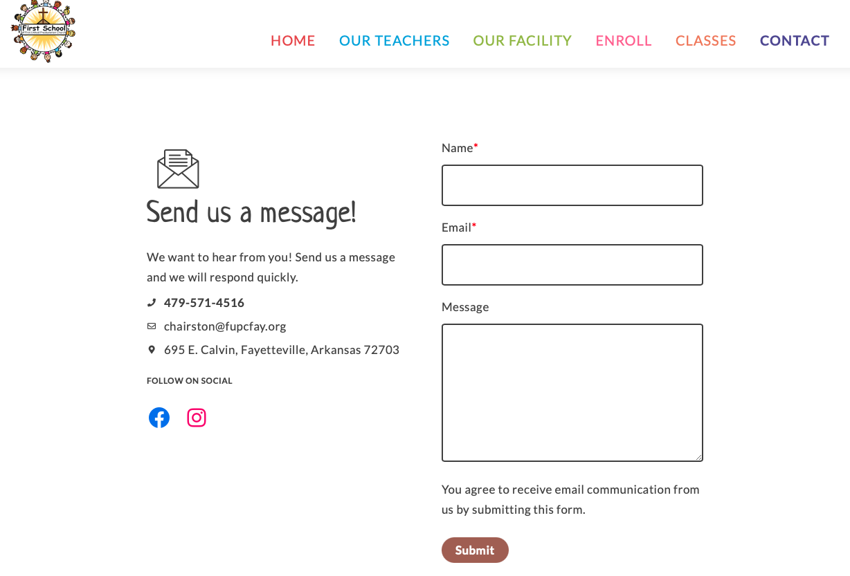
The screenshot at the top of this page shows the Contact page for a preschool. They have a physical location, email and phone, and a form to fill out.
If you are willing to give up some actual contacts in exchange for having less spam, leave out the form.
By contrast, a company that doesn’t want to share contact information may choose just to have a form, and not a map or street address.

Having a street address on your website is a good thing. It improves your local search results, it can get you links and citations in directories, Google Places, and Google Earth, and it makes you look more trustworthy.
However, people who work from their homes, who have a business in one place and want to appear to have it in another, or who have multiple businesses housed at one address may not care to provide contact information. Contact forms let you say this without an obvious, “Don’t all us, we’ll call you” air.
Your contact page can offer some guidelines for how you want people to get in touch with you, or how long it might be before you respond. It can offer multiple paths. The example below gives a physical address and hours as well as a phone number and a link to an inquiry form.

The specific contact options are different in each case, the level of friendliness is different, the design is different, the other elements on the page vary.
There is no need, in other words, to limit yourself to a standard layout or form.
However, there are some general guidelines for building the most effective Contact page:
- Have a specific Contact page. People who come specifically to look for such a page can get very upset when there isn’t one (we see it a lot in testing).
- Put your street address on the page, whether you are a local business or not, for best SEO results. If your reason for not listing your address is worth giving up the SEO benefits, that’s fine — just know that you are making that choice.
- Tailor your contact form to prequalify customers. Click through for an example. Testing (or reading the results of other people’s research, since this is a very thoroughly researched topic) can help you discourage or encourage responses from particular kinds of potential customers.
- Emphasize the type of contact you actually want. Unless the contact form is the only way to reach you, you will probably get more phone calls, emails, and walk-ins than you will submissions of your Contact form. But the Contact page is definitely a page which allows you to influence the behavior of the visitors who use it. Take the opportunity.
by
Tags:
Leave a Reply