Your cart is currently empty!
Page by Page: Goods and Services
There are many possible decision points in a website: some visitors will catch your phone number on the homepage and give you a call, some will read your blog posts and respond to the calls to action included in them, and some will browse your whole site and then go to your Contact page. One of the best places for conversion, however, is the page or pages where you describe your goods and services.
There is no one size fits all solution for these pages, simply because what you have to offer will be quite different from what another company has to offer.
Services

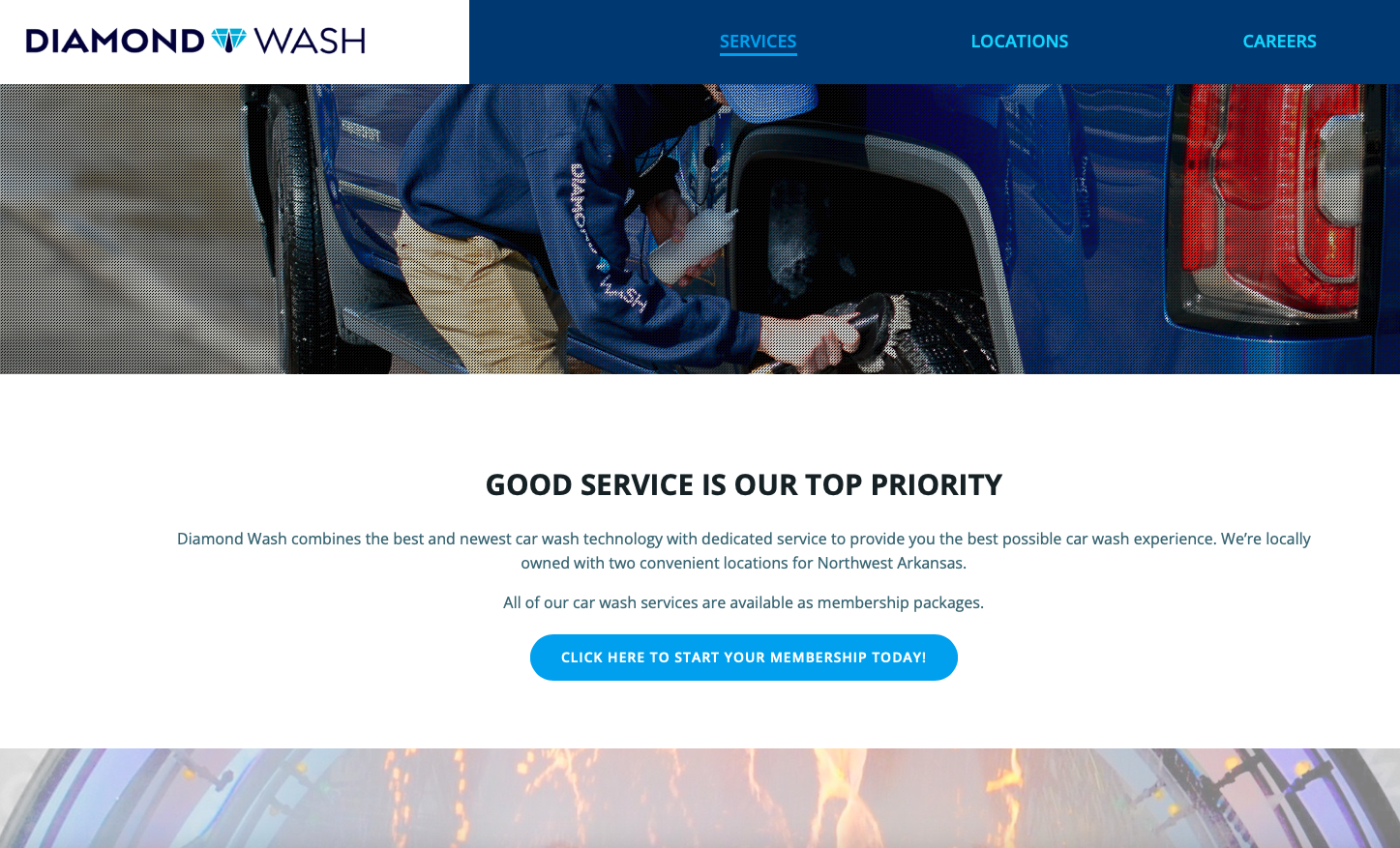
The first example here is from a day spa. Their site is for lead generation and for e-commerce. Their services are the most important offering, even though they deal in physical products, because they focus on cosmetic procedures and consultation rather than just selling skincare products.
They describe the various options they can provide in quite a bit of detail, because their customers often want more information, and because this demonstrates their expertise.
Some visitors don’t want to read all this and don’t need so much information. Don’t let that scare you — those visitors won’t click through to the additional pages. They will see the basic message on the services page and contact the company from there. The detail pages are for the people who want more detail. Give it to them.
Products

The second example requires much less description on the face of it, because the product is not one that people shop for. If you need a soft seated butterfly valve, you know what you need. Nobody browses diverting control valves to see whether anything catches their fancy. Customers for these products generally know what they want before they get there.  If they want to discuss the finer points of mussel filters, they will call to chat about it. Specific product information is available on the site in case studies, but the call to action involves a page for requesting a quote, not a shopping basket.
Goods and services pages
There is no one-size-fits-all solution for goods and services pages, but it’s very important to make sure that your particular goods and services pages do their job.
There are some common problems we see with goods and services pages:
- Duplicate content in descriptions of products — either cut and pasted descriptions from manufacturers, or lots of overlap in the descriptions used on a single site. These do you harm from an SEO standpoint.
- Lack of information or unclear descriptions and photos. We’re working right now on a website that uses a lot of specialize terminology. That’s fine for regular customers, but for neophytes it’s not enough information.
- No easy path to buy. It should be easy to get whatever you’re selling: anything that makes people stop and try to figure something out will discourage purchases and contacts. “Buy now” or “add to cart” buttons and contact numbers on every page are good. A booking engine is expected nowadays.
Testing is always a good plan, but it’s especially important on these pages, since there’s no standard approach.
by
Tags:
Leave a Reply