Your cart is currently empty!
Lab Report: End of Year Analytics
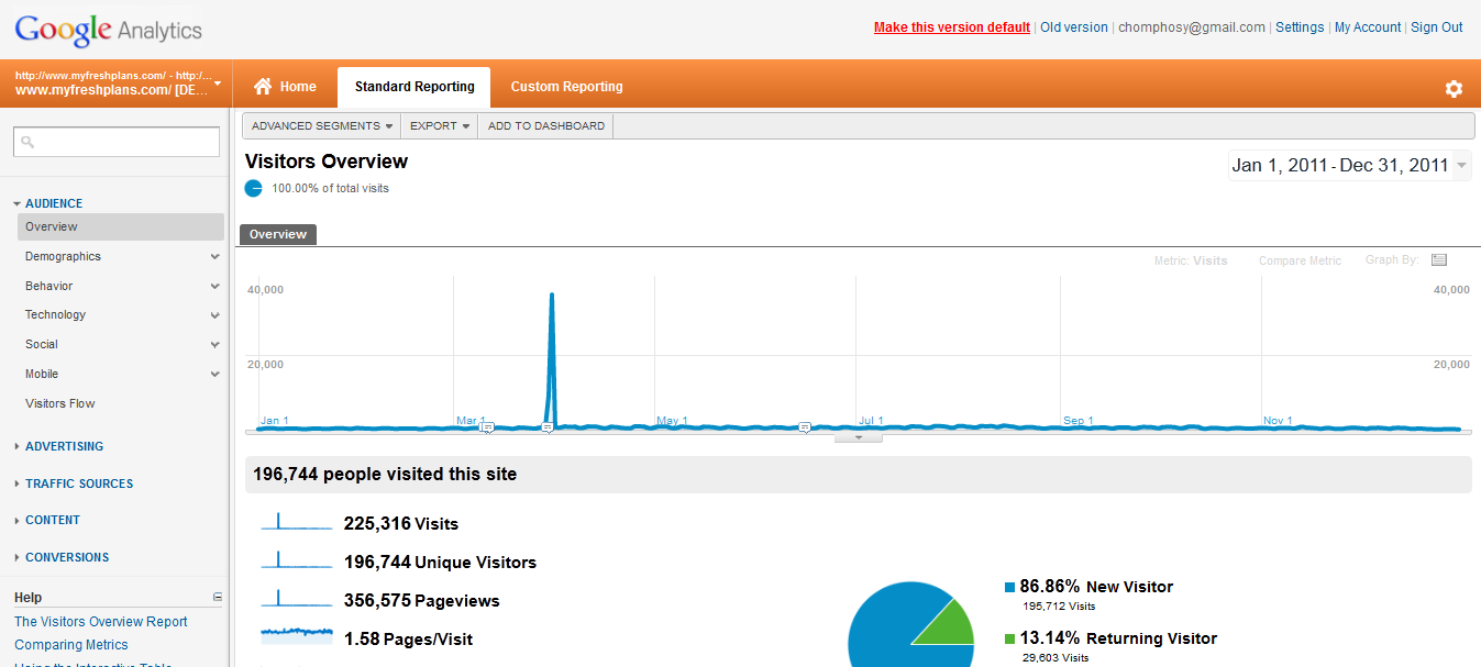
It’s unfortunate that the screenshot we have to show you for an end of year analytics analysis should be this one, because it’s very atypical. This is our lab site, FreshPlans, which was featured in the Google Doodle last spring, gaining that spike which dwarfs everything around it, making this chart useless.
We can’t show you all the other accounts we work with, but if we could, you’d be able to see that the blue line normally goes upwards, or perhaps up and down seasonally, or sometimes kind of straight across.If the line is falling, apart from the normal holiday slump at the end of the year, it’s a bad sign.
That’s really the first thing to look for when you check your year: is your traffic increasing? We look at the entire year, and then we look at smaller divisions, such as December of 2011 vs. December of 2010, if that data is available. We look at the various traffic sources, since you might see a rise in some areas which is offset by a fall elsewhere.
We look, too, while we’re at this first glance point, at conversions. These are often seasonal, so you may not see the upward trending line we like to see for traffic, but you should see year over year improvement.
You basically want to check first to see if things are improving. For most of the clients we’ve worked with all year, we do see improvements,and anything from 25% to 250% is normal improvement. Looking at sites we haven’t been working on, it’s not at all uncommon for us to see no improvement for years on end.
We also check the keywords that have brought traffic, the types of referring links that brought traffic (and which ones converted best), the geographic areas that performed best if that’s relevant for the client, the results of marketing campaigns, and the behavior of ecommerce and other goal funnels.
Next step: look at the surprises. FreshPlans had only about a 4% increase when we compared December 2011 vs 2010 — not exactly a surprise, since FreshPlans lost about half its traffic in an algorithm change in October, but we always want to know why when we see that small an improvement. If we compare May of 2011 with May of 2010, we see an increase of 3,560.60%, and we’d want to know what was up with that, too.
Some of the reasons we’ve seen for smaller than expected improvements:
- inaccurate measurement in the previous year (for example, workers were filtered out in 2011 but not in 2010)
- better targeted traffic
- overall drop in relevant searches
- reduction in ad spend
- change in marketing (i.e., the usual newsletter wasn’t sent or the previous year had a special campaign)
If you’ve been watching all year, as we have with FreshPlans, you shouldn’t be too surprised and you should have been responding to events during the year. If you just get an end of year report, you may have to dig.
I’ve met people who believe that traffic fluctuates randomly and you never know, but I’m not one of them. My feeling is that you should dig until you find out what’s going on, or at least come up with a reasonable hypothesis to guide future choices.
And that’s the next part of the end of year report: determining the next steps. Broadly speaking, you want to do more of what worked well, and put fewer resources into things that didn’t work well — or approach them differently.
Sometimes this is easy to see. For example, if we look at the less exciting part of the year at FreshPlans — the part between the Google Doodle and the algorithm change slapdown — we can see that we had year over year increases of 300% and 400% for direct and search traffic, but only 30% for referral traffic. This is a site that could use some linkbuilding.
In other cases, it can take more digging. For one of our clients, we saw indications that one small segment of their visitor population might be converting better than the others. Josepha spent a couple of hours crafting special segments and finally discovered that they were in fact spending ten times as much as the site average — a fact that might easily have escaped us because they are a small group.
In short, come at your end of year report as though you were in an airplane:
- Get an overall view to make sure things are generally on track.
- Zoom in a little closer to see what’s surprising and figure out why.
- Get in real close to determine what you should do with your website in the coming year.
Land on a solid strategic goal, and you’re set.
If you have collected the data but you’re not seeing what to do with it, contact us at Rebecca@HadenInteractive.co, Rosamond@HadenInteractive.com, or Josepha@HadenInteractive.com, and we’ll help you get from data to decisions.
Leave a Reply