Your cart is currently empty!
Road to a Landing Page
We’re building a landing page for America’s Best Franchises, to replace their old media kit, which had become outdated. In order to allow the best tracking and frequent updates, we’re building it at their website, as a page which will not be included in the navigation.
We’d like to share the process with you, since it’s a good little example of how a custom web design is created. The screenshots below are from Notable, a tool we use for customer feedback and collaboration. It allows us all to make notes on specific items on a mockup. Here’s how it works:
- I prepare the text and send it to Tom.
- Tom creates the mockup, loads it into Notable, gets feedback from me and from the client, makes changes, and refines the design.
- Once the design is approved, he builds the page.
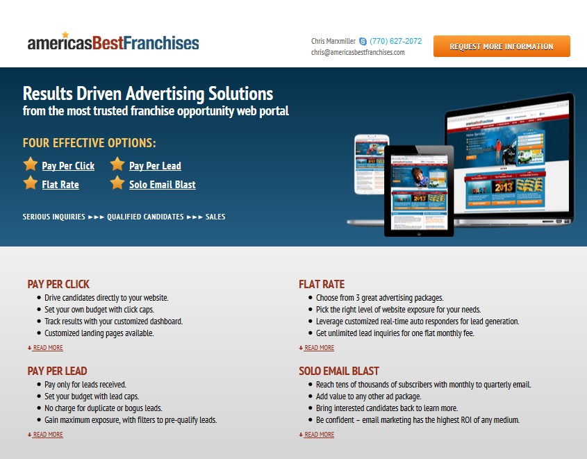
The site owner came to us with a clear idea of the content and the basic layout. Tom’s first design was a bold, colorful stacked page using the colors of the website:

The first round of feedback focused on small items:
- The four main ad options are presented quickly for people reading the page online, and each offers a “read more” button which takes viewers down the page. This is a highly usable plan. However, the level of contrast between text and background might make it hard for older visitors to read.
- Another change for usability: adding bullets will make it more scannable, and we know that web visitors often scan.
- We asked the client for his choice of testimonials, and he asked for a link to his testimonials page.
- The fourth comment, not visible here, was a change in content.
- The client wanted something brighter here.
- An inaccuracy in the content needed correction.
Often the first things that catch your eye when you look at a mockup are small things. Adding bullets, increasing contrast, and catching changes in information are quick fixes.
Once the initial concerns are addressed, it’s time to hone in on all the little things that make the page perfect. We made a number of color changes and text changes:

At this point, the page is usually finished. In this case, however — and this is not uncommon — the client felt even after the fine-tuning that the page wasn’t quite what he wanted. He was using terms like “pop” and “sizzle,” which have been the source of many snarky blog posts by designers. Not that we’re opposed to pop and sizzle, but they tend to be a sign of that vague “not what I wanted” feeling rather than specific feedback.
 We got on the phone and identified the issue. In this case, it boiled down to the use of white space. Once we fully understood the client’s feedback, it was easy to meet his needs, and the notes on the final mockup, at left, all said things like “Awesome!” and “Perfect!”
We still have the trendy stacked layout, the eye-catching header, and the combination of mostly neutral backgrounds with strongly contrasting text and bright colored accents.
The lower sections no longer have a column of empty space on the left. Instead, bright screen shots with varied placement keep the page lively without clutter.
For those who interact with the page online, we have a clear statement of the offers above the fold, with readable, scannable text presenting all the details below.
Each section is attractive and persuasive on its own. There’s a good level of variety and color for pop and sizzle, but the overall look is harmonious. If visitors choose to print the page out, they’ll still have a good experience.
The client has already begun using the header on other materials, too.
We’re working here with a WordPress site, but you’ll notice that we’re not working with a theme that limits the options for placing text and images. The landing page is built as a webpage using the most current versions of HTML and CSS. It’s responsive, so the client can easily send it to his customers, use it in social media, or pull it up on a phone or tablet in a sales meeting. Custom WordPress sites don’t have the limitations of a pre-made theme.
When you work with a designer to create a custom website or landing page, you should expect a process something like this. Each firm will have its own way of doing things, of course, but you shouldn’t have to take it or leave it — nor should you expect to have lots of options to pick from. That’s usual when you are buying a theme, but not when you’re building a website.
by
Tags:
Comments
2 responses to “Road to a Landing Page”
-
Very efficient way to do this Rebecca. I haven’t heard of Notable before. I have known of some others but am checking out Notable now.
You guys need an awesome job with that landing page too!
-
Thanks, Todd! I think you’ll like Notable.
-
Leave a Reply