Your cart is currently empty!
Your Website Is Not a Piece of Paper
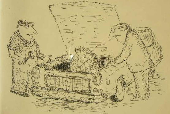
This very famous cartoon by Edward Koren has the caption, “Well, there’s your problem.”
I thought of it immediately when I looked at this website.
It was a very attractive website, as you can see from this little piece of it. All the words there, by the way, are graphics.

There is the phrase “tissue lysates” at one point, but this is essentially a content-free page.
We were admiring it, thinking what a nice print ad it would make. It has an elegant design, and apart from the navigation buttons at the bottom, there’s nothing about it that would cause you to think it was a website.
The client isn’t happy with the website’s performance. They don’t show up for search for any of their keywords, and they don’t get the kind of sales they’d like.
I instantly thought of Koran’s mechanic.
From the point of view of the search engines, this is a page that says “tissue lysates.” The fine graphic design, the carefully-chosen words incorporated into the graphics files — those have no meaning at all for the search engines.
The site owner isn’t ranking for their keywords because Google has no clue what’s going on at that page, and no way to guess.
From the point of view of the human visitor, this is a lovely page. You can sit and admire the spiralling DNA and the happy bunny and the dedicated scientist, but there’s no indication of what’s happening here or where you’re supposed to go.
The navigation bar is composed of the bottom row of butter-colored squares with subtle white words on them, and human visitors may eventually find them.
Imagine walking into an elevator. You step in, turn to face the front, reach out with your right hand for the tidy row of buttons that is always in the same spot — and it isn’t there. Instead, the designers have decided to put the buttons in subtle swirly patterns on the opposite wall, near the floor.
This is roughly the effect of the yellow squares with their delicate suggestions of words on them. Perhaps “contact” and “search” are part of the artist’s concept, just like the mouse on the calendar? Oh, no — now you can see that this is actually the navigation bar, cunningly disguised.
Your human visitors just aren’t supposed to have to work that hard. And the search engines won’t work that hard. So the diagnosis of the problem was really easy: this page needs some content.
The problem for many websites is that they’ve been designed as though they were a literal print page for someone to look at. That’s just not how people use the internet. People don’t interact with a web page the way they do with a print page. And search engines, of course, don’t interact with print pages at all.
If you’ve forgotten that when you planned your website, then you really don’t need to look any further when seeking the reason for your website’s disappointing results.
by
Tags:
Leave a Reply