Your cart is currently empty!
The Unplanned Website
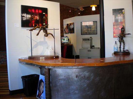
Designer Tom Hapgood and I sat down yesterday to plan a new site we’re doing for a dentist who practices in an art gallery. Pretty cool, eh?
The doctor has a website right now, and Tom and I were sort of marveling at it. It begins with a flash page showing a variety of renderings of the office, which you can see in the photo. The images are reminiscent of video games and really don’t suggest dentistry at all.
There are words below the show, and when we clicked on them yesterday most were broken and we couldn’t get in at all.
When we were able to get in, we found a wide variety of things, from a very snazzy toy that shows pictures from the gallery in a wide variety of ways to pages in the main navigation which announced that we didn’t have access. Most of the pages do something interesting, and the site is a lot of fun to play with.
This is fun for us, but probably not for people looking for a dentist. This list will show you the problems that can arise when a site just grows organically without a real plan:
- It’s not findable. This very special and intriguing office isn’t at the top of searches for the name of the doctor or the name of the practice when you search in the town where it’s located. More general searches don’t find it at all.
- It’s not usable. I enjoyed browsing around this site very much, but if I had been looking for a dentist who accepts my insurance, or trying to find the office hours or something, I would have given up and chosen another dentist. Chances are, lots of people do just that.
- It’s not navigable. While there is a page that allows you to move a sort of artsy pinwheel around in space and you can on several pages mouseover different things to cause an assortment of interesting navigation options to peek out and then scurry away, the site includes so many dead ends that it basically doesn’t work.
You’ve heard it said that a camel is a horse put together by a committee. Your website can suffer the same fate if there’s no clear site architecture planned. We’re going to build a new site that meets the functional goals of the practice, while still keeping the snazzy feel of the current site. A WordPress platform will allow us to incorporate a lot of fancy effects in an economical way (less time coding!) and will also let the office staff update easily.
Here are some questions you should answer before your web folks begin work:
- What are you offering? In our example, the site owners are offering both art and dentistry, and that’s fine. It’s an interesting creative challenge, something we love. But if you aren’t quite sure what your company does, you’re not ready for a website. (Our colleague Shan calls that “having a fluid business plan.”) It’s the same as writing a paper or an article: you have to know your main point before you start writing, or you’ll end up with a mess.
- What do you want your visitors to do? Our new client wants new patients to contact the practice, they want established patients to book appointments and get answers to their questions, and they also want their website visitors to be exposed to local art. Tom will make sure that the site has the artistic look and feel of the gallery, and I’ll make sure visitors can get their veneers scheduled and paid for.
- What do you need the site to do? Modern websites don’t have to be like an electric brochure. There may be many things that your website can help out with. The owners of the site we’re discussing here want to be able to send emails and collect the addresses for that purpose, to arrange for bookings, to provide electronic and PDF versions of patient forms, and also to have lots of information about the staff, the artists, and the community. Knowing these things ahead of time, we’ll be able to structure the site correctly to accommodate and — when appropriate — showcase these elements.
With this information, your web people can design a good site architecture for your website, and it won’t remind anyone of a camel.
by
Tags:
Leave a Reply